More selected projects

Design System: ClearChart

Design System: ClearChart
A Scalable Design System Tailored for Fintech & Healthcare

Product Design: Assist Policies

Product Design: Assist Policies
My Design Process & Outcomes for ADP HR and Employees

Inside Design: Artifacts & Methodologies

Inside Design: Artifacts & Methodologies
Journey Maps, User Flows, Prototypes & More...

GDVSource

GDVSource
Branding Project

Trenton Farms

Trenton Farms
Branding Project

nūtrious

nūtrious
Visual Design Project

iamHeart

iamHeart
Visual Design Project

Product Design: nūtrious

Product Design: nūtrious
Health & Nutrition App Designed for a Startup

Service Design: iamHeart

Service Design: iamHeart
Reimagined: Mobile-First Responsive Design

Service Design: GDVSource

Service Design: GDVSource
Reimagined: Mobile-First Responsive Design

Proof of Concept: SuperFan

Proof of Concept: SuperFan
UX Design - Brainstorming a Feature

  • Home
  • UX / Product Design
  • Visual Design
  • Branding
  • Bio + Résumé
  • Case Studies
  • Let’s Connect
Slide 1 from the ClearChart Design System presentation, showing logo and word mark of company with colorful background to set the stage to understand the productSlide 1 from the ClearChart Design System presentation, showing logo and word mark of company with colorful background to set the stage to understand the product
Slide 2 explaining what is ClearChart and vision statementSlide 2 explaining what is ClearChart and vision statement
Slide 3 nine images of different core users and some body copy about product consumersSlide 3 nine images of different core users and some body copy about product consumers
Slide 4 discusses system mapping and planning for ClearChartSlide 4 discusses system mapping and planning for ClearChart
Slide 5 from the ClearChart Design System presentation showing a graphical connection map of the one-brand ClearChart systemSlide 5 from the ClearChart Design System presentation showing a graphical connection map of the one-brand ClearChart system
Slide 6 from the ClearChart Design System presentation showing heading text that reads Foundations and setting up colorsSlide 6 from the ClearChart Design System presentation showing heading text that reads Foundations and setting up colors
Slide 7 from the ClearChart Design System presentation showing color palettes for light and dark modesSlide 7 from the ClearChart Design System presentation showing color palettes for light and dark modes
Slide 8 from the ClearChart Design System presentation showing images of color primitives and semanticsSlide 8 from the ClearChart Design System presentation showing images of color primitives and semantics
Slide 9 from the ClearChart Design System presentation showing themed data visualizations for light and dark modesSlide 9 from the ClearChart Design System presentation showing themed data visualizations for light and dark modes
Slide 10 from the ClearChart Design System presentation displaying the title for the Typography section, highlighting font selectionSlide 10 from the ClearChart Design System presentation displaying the title for the Typography section, highlighting font selection
Slide 11 from the ClearChart Design System presentation displaying Typography used for headings and body textSlide 11 from the ClearChart Design System presentation displaying Typography used for headings and body text
Slide 12 from the ClearChart Design System presentation displaying Typography used for links, labels and input fieldsSlide 12 from the ClearChart Design System presentation displaying Typography used for links, labels and input fields
Slide 13 from the ClearChart Design System presentation displaying IBM Plex Mono typeface used for code elements like data tablesSlide 13 from the ClearChart Design System presentation displaying IBM Plex Mono typeface used for code elements like data tables
Slide 14 from the ClearChart Design System presentation displaying type styles as shown in FigmaSlide 14 from the ClearChart Design System presentation displaying type styles as shown in Figma
Slide 15 from the ClearChart Design System presentation displaying icons chosen for actions, feedback, and UI elementsSlide 15 from the ClearChart Design System presentation displaying icons chosen for actions, feedback, and UI elements
Slide 16 from the ClearChart Design System presentation displaying icons component groupsSlide 16 from the ClearChart Design System presentation displaying icons component groups
Slide 17 from the ClearChart Design System presentation displaying components organized as atoms, molecules, and organismsSlide 17 from the ClearChart Design System presentation displaying components organized as atoms, molecules, and organisms
Slide 18 from the ClearChart Design System presentation displaying component buttons along with their specificationsSlide 18 from the ClearChart Design System presentation displaying component buttons along with their specifications
Slide 19 from the ClearChart Design System presentation demonstrating how data cards function with light and dark mode theming in FigmaSlide 19 from the ClearChart Design System presentation demonstrating how data cards function with light and dark mode theming in Figma

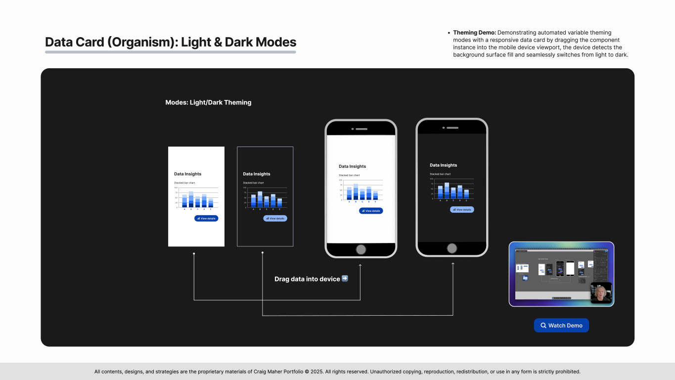
🔍 Watch theming demo (Figma)

Slide 20 from the ClearChart Design System presentation demonstrating a high-fidelity dashboard layout with Figma grids, featuring data visualizationsSlide 20 from the ClearChart Design System presentation demonstrating a high-fidelity dashboard layout with Figma grids, featuring data visualizations
Slide 21 from the ClearChart Design System presentation demonstrating breakpoints and the setup of viewport sizesSlide 21 from the ClearChart Design System presentation demonstrating breakpoints and the setup of viewport sizes
Slide 22 from the ClearChart Design System presentation demonstrating breakpoints for mobile and tabletSlide 22 from the ClearChart Design System presentation demonstrating breakpoints for mobile and tablet
Slide 23 from the ClearChart Design System presentation demonstrating breakpoints for desktop and XL screensSlide 23 from the ClearChart Design System presentation demonstrating breakpoints for desktop and XL screens
Slide 24 from the ClearChart Design System presentation demonstrating next steps in the projectSlide 24 from the ClearChart Design System presentation demonstrating next steps in the project
Slide 25 from the ClearChart Design System presentation closing statements and Q&A with my contact informationSlide 25 from the ClearChart Design System presentation closing statements and Q&A with my contact information

More selected projects

Design System: ClearChart

Design System: ClearChart
A Scalable Design System Tailored for Fintech & Healthcare

Product Design: Assist Policies

Product Design: Assist Policies
My Design Process & Outcomes for ADP HR and Employees

Inside Design: Artifacts & Methodologies

Inside Design: Artifacts & Methodologies
Journey Maps, User Flows, Prototypes & More...

GDVSource

GDVSource
Branding Project

Trenton Farms

Trenton Farms
Branding Project

nūtrious

nūtrious
Visual Design Project

iamHeart

iamHeart
Visual Design Project

Product Design: nūtrious

Product Design: nūtrious
Health & Nutrition App Designed for a Startup

Service Design: iamHeart

Service Design: iamHeart
Reimagined: Mobile-First Responsive Design

Service Design: GDVSource

Service Design: GDVSource
Reimagined: Mobile-First Responsive Design

Proof of Concept: SuperFan

Proof of Concept: SuperFan
UX Design - Brainstorming a Feature

All contents, designs & strategies are the proprietary materials of Craig Maher Portfolio © 2026. All rights reserved.