Project GDVSource…
Overview
GDVSource is an energy measurement / biotech startup based in the US. It trains, educates, sells and distributes Kirlian devices and software created by a Russian-based parent company. The GDV (gas discharge visualization) camera is a biomedical device that is used to measure a subject’s energy fields and to a large extent, it has been used in alternative medicine research and other holistic studies. The company's CEO, Mary Milroy, has an engineering and light medicine background in cutting-edge technology using ancient Chinese healing techniques. Their brand promise and tagline is the following: Transforming Lives One Vibration at a Time!
The What
• What was designed: Redesign of an existing website (Responsive)
• UX problems being solved: Site Accessibility, Content, Target Audiences, Site Architecture, Business Prioritization, Layout, Visuals & UI
• Approach: Agile (Focused on solving high-level user / business needs: Home, Training and Community Specific)
• Tools Used: People, Pen & Paper, Audio memos, Adobe illustrator, Photoshop, Axure
The Who
• Client: GDVSource — Enterprising startup
• Target audience: Medical Professionals, Researchers, Alternative Health Practitioners, Kirlian Enthusiast & Novices
• Industry: BioTech / Health & Wellness
• Business Goal: To remain the leader in GDV sales & services. Also, fostering community in continuing education and attracting investors.
Process
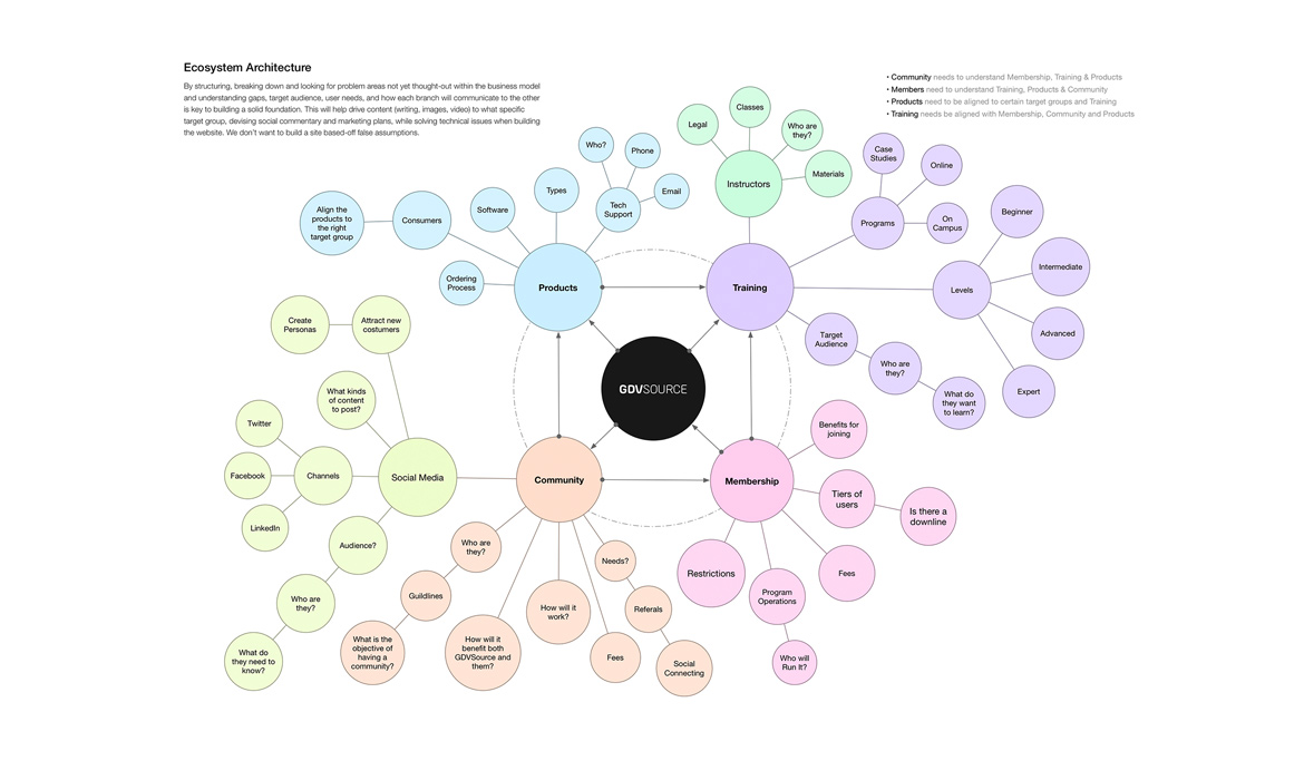
My decisions were based on what matters most to the users. Each project has its own set of problems to solve and its own solutions or results. Regarding this project scope, I wore all hats in the development of this project including rebranding, UX/UI, Visual Design and some Front-end coding utilizing the bootstrap responsive framework. The process consisted of sitting down with the founder and strategizing an action plan to deep-dive GDVSource’s ecosystem and help prioritize the business. My solution: An ecosystem map would help us to "see" the many business channels internally / externally.
Next was defining and gathering insights from key target audiences that could potentially use the website / products both before and after the new site was deployed. I started out by understanding what the company does, and how its position in the marketplace again was getting the company to see the value / benefits of its product, and "why" it’s in business in the first place. It involved sitting down with the founder and gathering insight on company vision, mission and where they see themselves over a short-term, mid-term and long-term timeline and what goals they had in mind.
I performed research around one specific group of preexisting GDV product / website users, interviewed them, obtained user feedback, conducted competitive feature analysis, and designed user flows, sitemap and medium-fidelity wireframes that are both interactive and convey high-level tasks around training. Next, we then moved into high-fidelity and front-end development for additional user feedback and further device testing. The project outline is broken down through Steps 1 — 6, ending with my Results and Next Steps:
Problem Statement: 1) Non-responsive site for accessing on mobile / tablet 2) Hard to navigate pre-existing website to understand home page (brand messaging), as well as find online training courses and product details & benefits 3) Site architecture and taxonomies are convoluted and congested, making it unclear for users to navigate site 4) No structure for online training programs / course levels and on-boarding “sign up” for online courses 5) User interface / UI is disjointed and nonuser-friendly, with no real CTA (call-to-action) interaction.
Hypothesis: 1) Clear business value prop and benefits for product + services 2) Prioritize the primary goals of the business + users 3) Develop a user-centered responsive website so customers can access on all devices 4) Improve visuals and UI 5) Streamline the “sign up” process in 4 steps: Find, Read, See, Sign Up 6) Develop a product "GDV community" that will help garner a larger customer base / build brand loyalty with user reviews, user feedback for understanding future site improvements and other opportunistic product channels.
Step 1: Ecosystem Architecture
I was invested completely in building out a new GDVSource website and getting the client on-board with understanding what the "what" was here and "how" we were going to structure all the branches of the company's products, services, membership and new community that were all tightly interlinked. Since the founder was from an engineering background, I thought it would be a good idea to show a schematic (something that an engineer was used to seeing), speaking her language. I devised an "ecosystem map." This map would aid in the visualization of the many layers / components needed to address before the new website was even conceived. The purpose of this exercise was to break down and look for problem areas / opportunities not yet thought-out within the business model. Understanding just how big the underbelly was behind the scenes was pretty scary, but addressing the product gaps, target audiences, membership structures, etc. would hopefully pay off in the end product. We looked into how each subset would communicate to the other and addressing key ways of building a solid business foundation. We defined core sections as: Training, Products, Membership & Community that revolved around the brand. View the Eco-Architecture below.

Step 2: Research, Persona & Audit
Doing my due diligence and having the documentation that supports and justifies "why" I'm designing and making design decisions revolve around GDVSource’s target audiences and are anchored in user stories. I defined targeted users, conducted qualitative interviews and created a persona that will be used for centralized focus for this website redo experience. Audiences included: Medical Professionals, Researchers, Alternative Health Practitioners, Kirlian Enthusiast & Novices. Similar to most of my other projects, my design ideas start to form after having both Quantitative and Qualitative data in-hand to back up my decision-making process. I started crafting my pre-interview script and participant incentives of $50 off their next training sessions. This was an effective way to let customers know they are valued for their time and input needed to build out a better user experience the next time around.
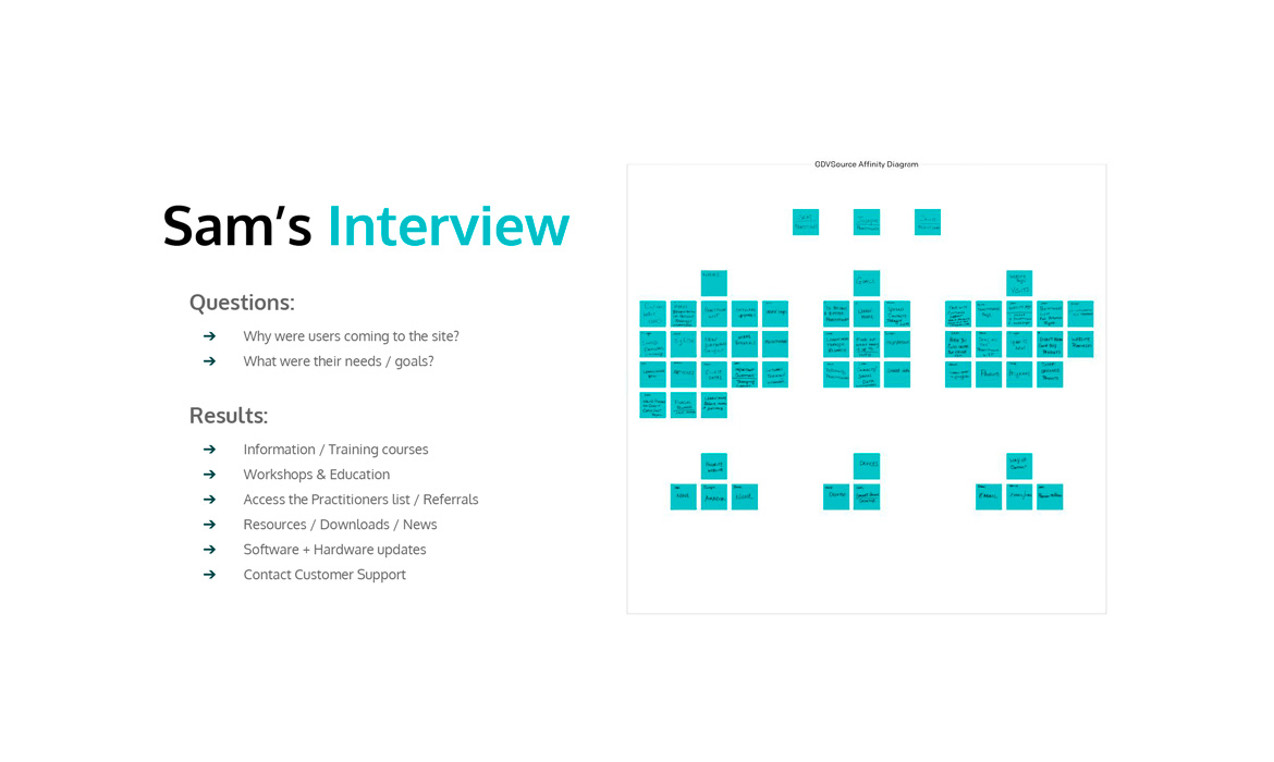
Quantitative Research: The first step was finding out if any google analytics were set up on the preexisting site to track users’ habits and "bounce" rates, as well as demographics, pages of interest and device prioritization. Unfortunately, no analytics prior to this were properly installed to collect proper data, so I decided on live, "Qualitative" interviews as option B.
Qualitative Interview Questions: 1) Primary reason you visit GDVSource.com 2) What products do you own of GDV? 3) What page / pages do you visit on the site? Why? 4) What’s that journey like for you? Can you tell me more about that? 5) Have you ever purchased anything from the GDV website? What was it like for you? 6) Are there any frustrations in the checkout process? How can we make that better? 7) What is the biggest barrier to you buying one of the GDV products? How could we help you to overcome that barrier? 8) What other websites do you visit or use for getting your GDV needs met? 9) What devices do you use when visiting, buying or contacting GDVSource?
Research Findings: Uncovered needs of 1) Training programs 2) Webinars 3) Software updates 4) Referrals 5) Contacting customer support.
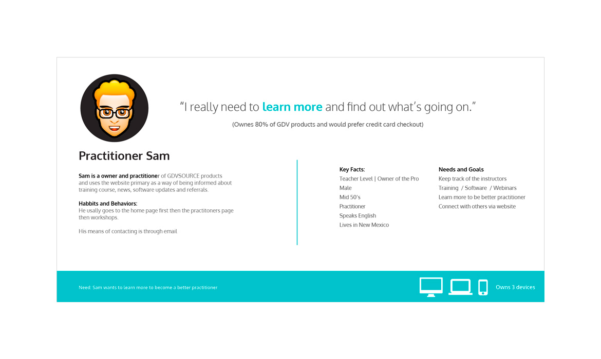
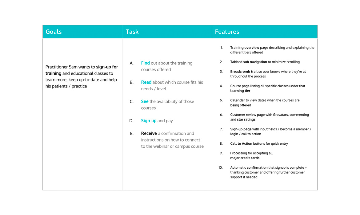
Persona: Built out Primary (‘Sam the Medical Professional’) persona template to help client visualize and understand core key facts, needs and goals, lifestyle and tech habits of an archetypal user of the site.
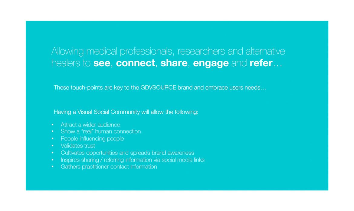
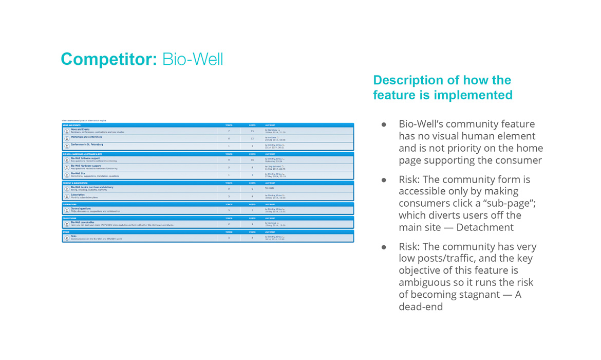
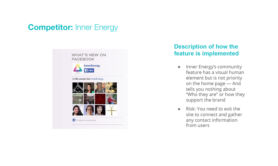
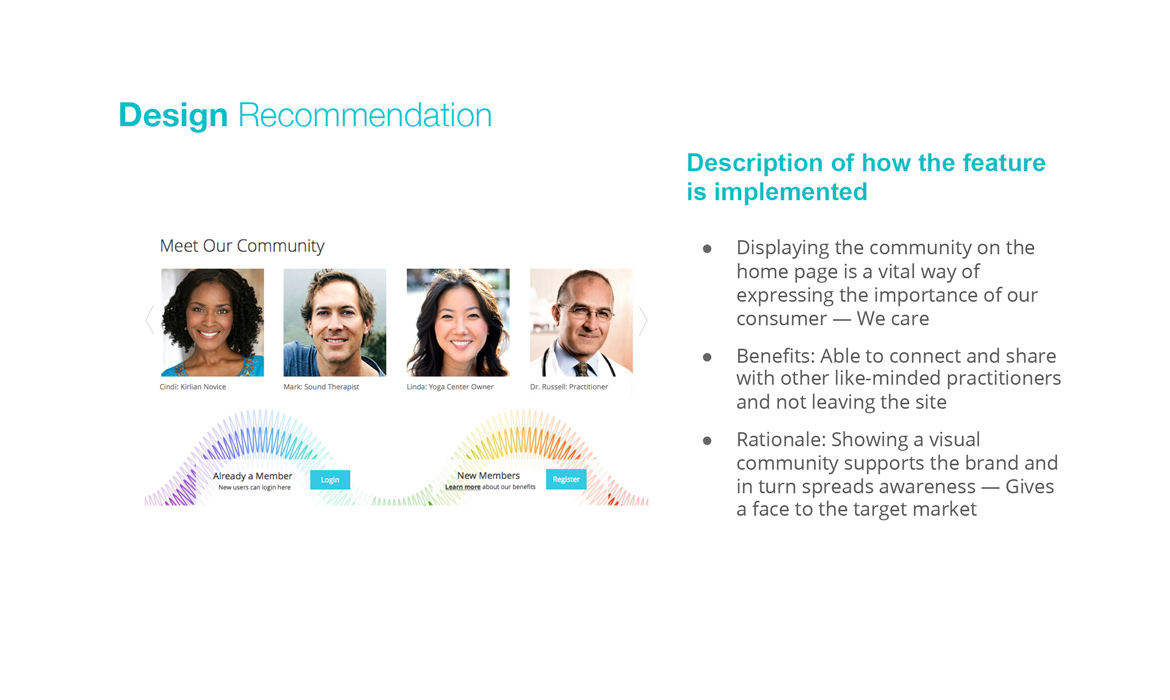
Competitive Research: Building a visual social community as seen on slides 4 — 8 was the beginning of looking at what GDVSource’s competition was doing as far as building brand awareness and support around their users. This plug-in feature could help drive customers to feel like they are a part of something new in the GDV field: See, connect, share, engage and refer.
Product Focus: I chose to focus on designing around "Sam's" core needs and goals for training programs and online signing up).
Step 3: Sketches, Features, Flow & Card Sort
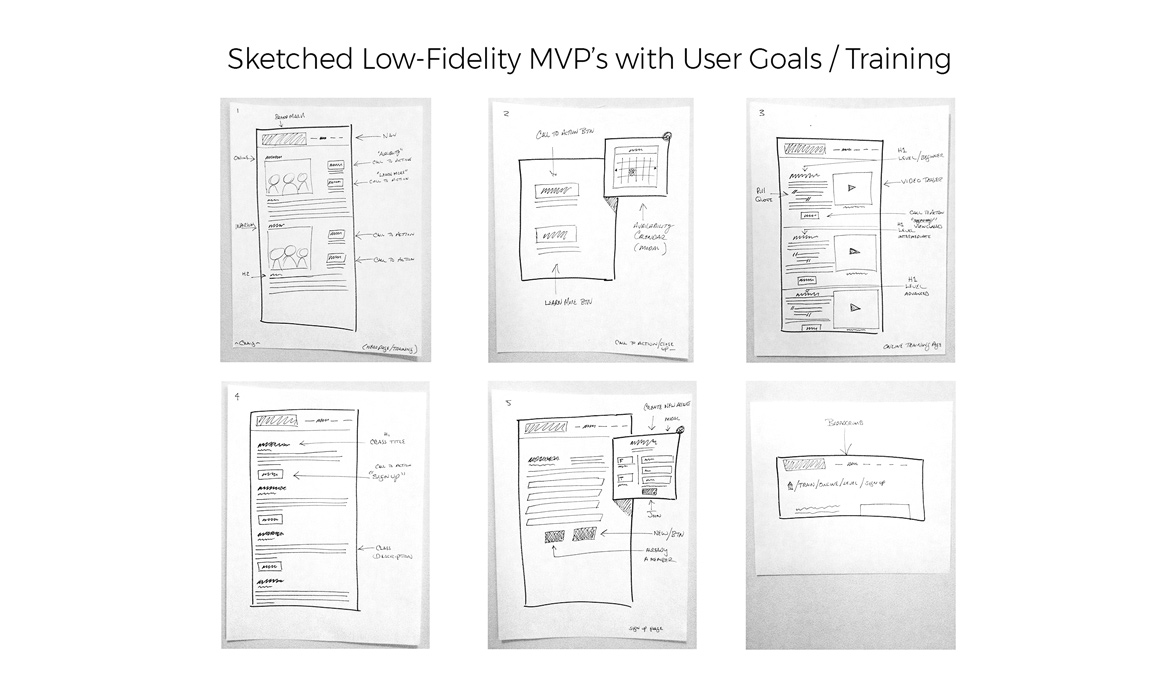
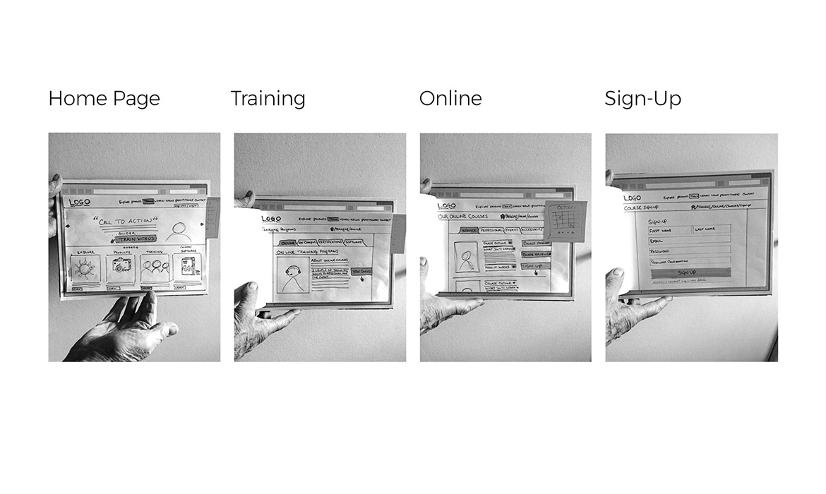
Turning research into visuals indicated with my low-fidelity MVP sketches below. I implemented an agile "fail fast" approach of building out and solving a singular high-level goal, and received quick user input about what was working for them and what was not. I annotated and included proposed features based on Sam's goals. I conducted some iterative testing on users to flesh out further frustrations / pain points before I started on wireframing and UI.
Feature Prioritization: This was based on "Sam's" goals and included course reviews, confirmation emails, video teasers about classes, payment options, calendar / dates and course location. Shown in Slide 3.
Prototype: I constructed a makeshift cardboard browser screen showing primary steps in achieving Sam's goal of traversing from the home page to signing up for an online course. (You can my dad's hands as a prop to show guiding potential users through the steps.) See slide 2.
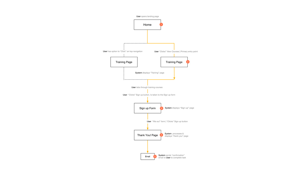
User Flow: Defining the logical steps or "happy path" along the users’ journey to reach their end task helps me think out the steps in a user journey. The flow shows display pages, system decisions and user actions. This is also where I can start to think about the Graphical User Interface / UI as well CTA. Seen on slide 4.
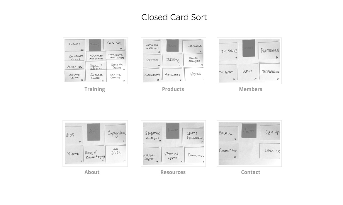
Closed Card Sort: I ran a closed card sort on this project. My rationale was I wanted to get users to bucket content / tasks into the six predefined top-level categories that were not too far away from the existing site naming conventions.
Step 4: Grid, Wireframes, Sitemap & Content
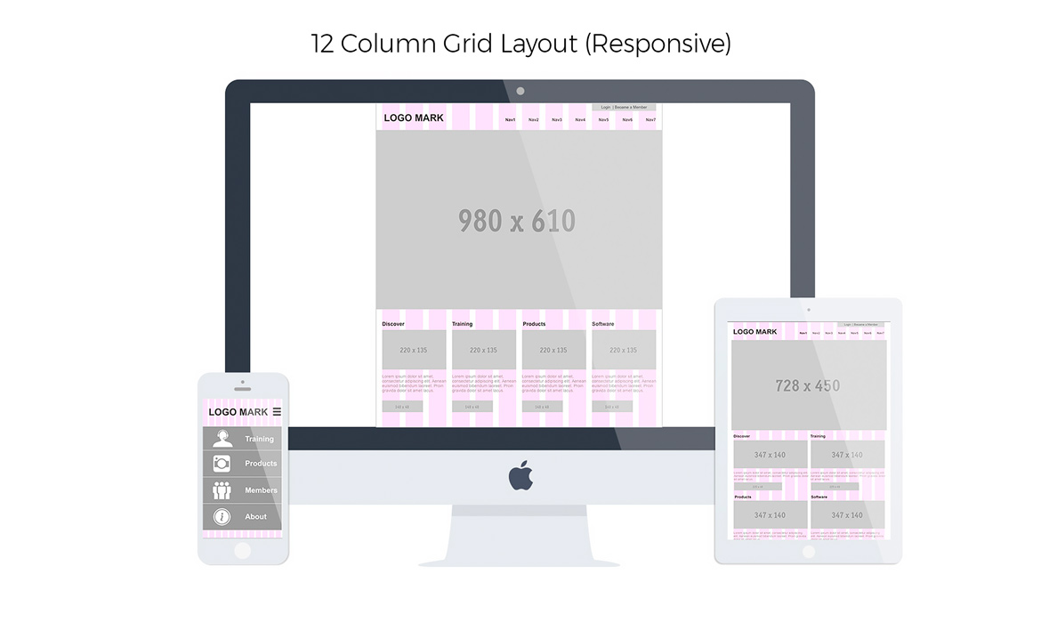
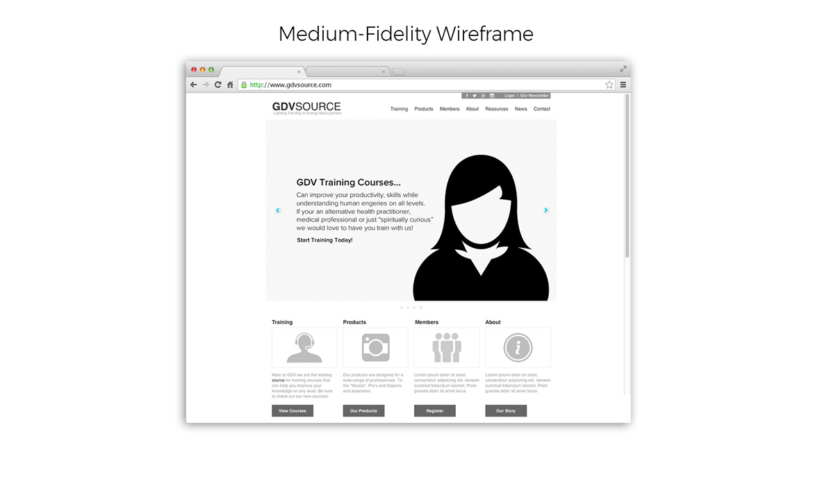
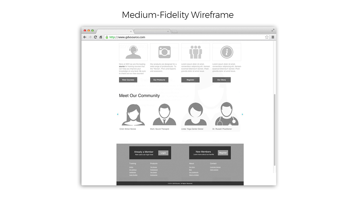
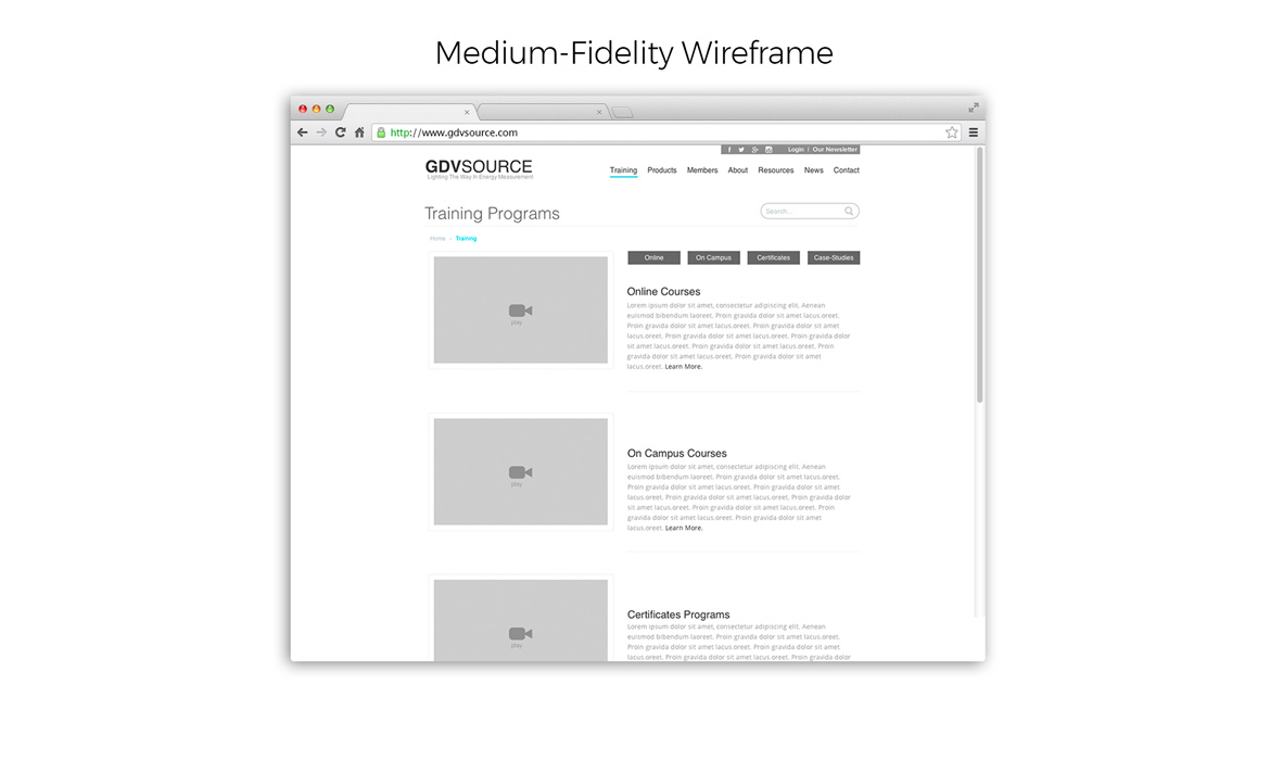
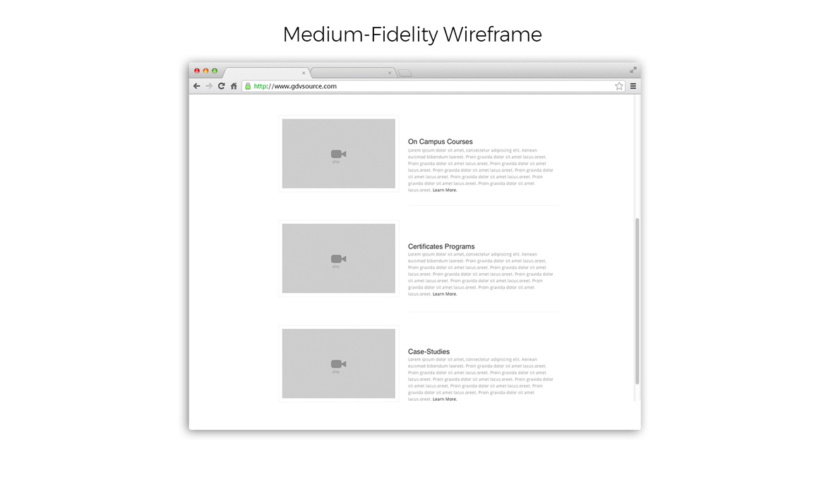
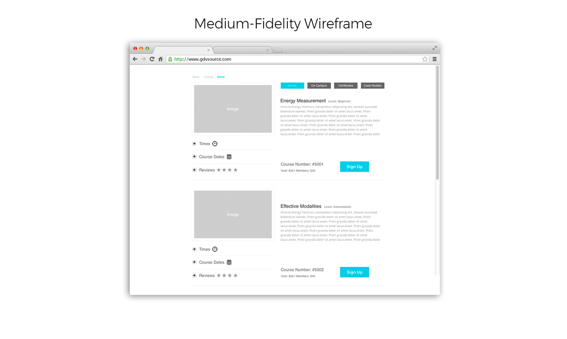
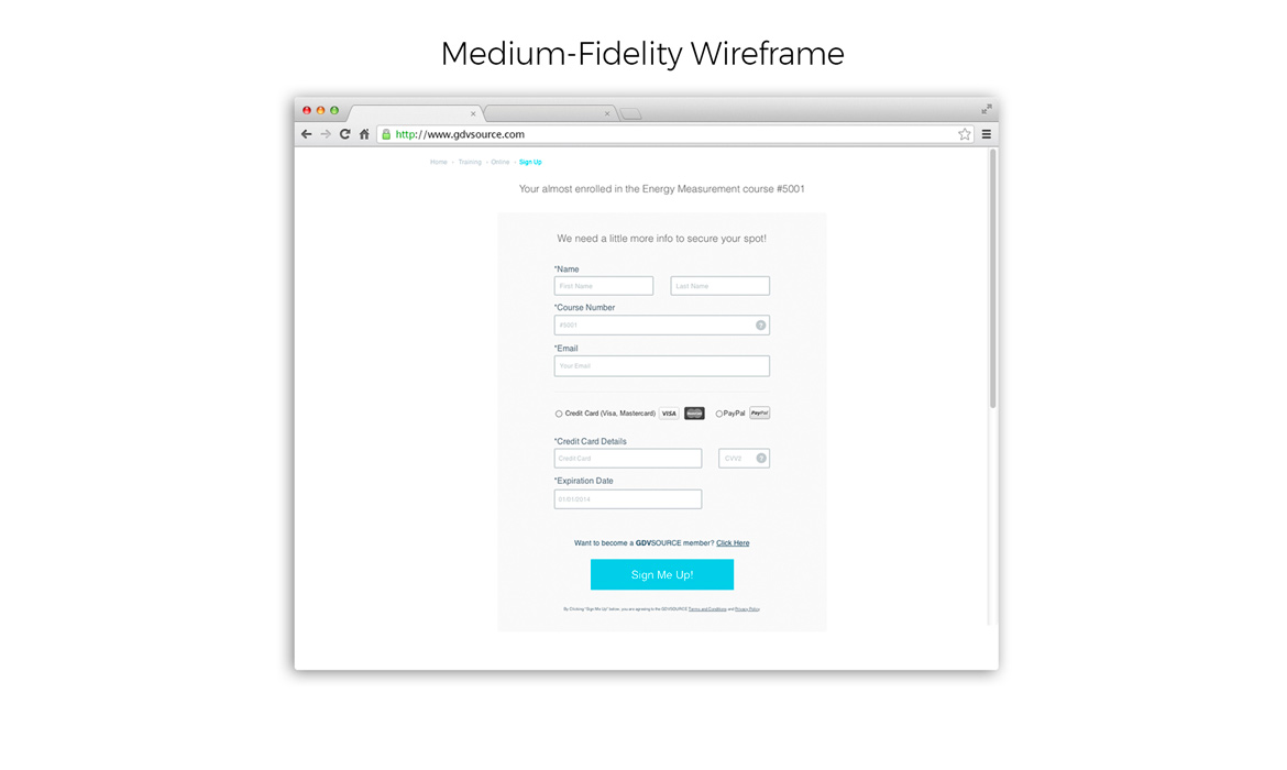
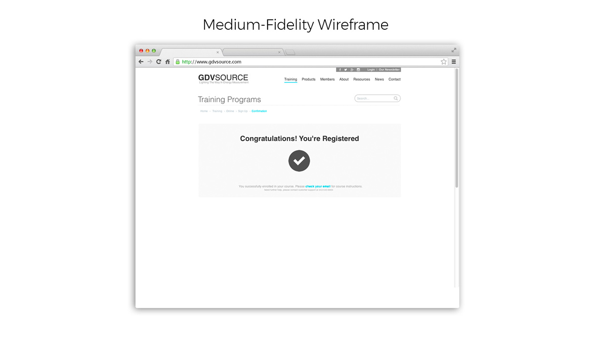
Working from MVP Sketches to medium-level prototypes and designing on a framework was my next step in the flow of things. I love the number 12 because it's divisible by 2, 3, 4, 5, 6, 8, 10, 12, 15, 16, 20, etc., making it fluid. Also, I used Twitter's bootstrap framework that is devised around a 12-column grid, so, it's a perfect choice for responsive projects. These are what I consider to be medium-level prototypes that are interactive "clickable" with core user features that need to be communicated. They have a more defined, lucid hierarchy of UI, white space, layout / grid, content strategy and the typeface. They also convey simple CTA buttons to guide users on next steps, etc. These will also serve for additional usability testing. I invite you to "click through" the slides below.
Slide 1: Shows 12 Column / 1200px grid system for layout of FPO content with Hero image on Desktop & Tablet viewports
Slides 2—8: Shows a medium-level prototype evolution of Home, Training programs, online course sign up, payment form & confirmation
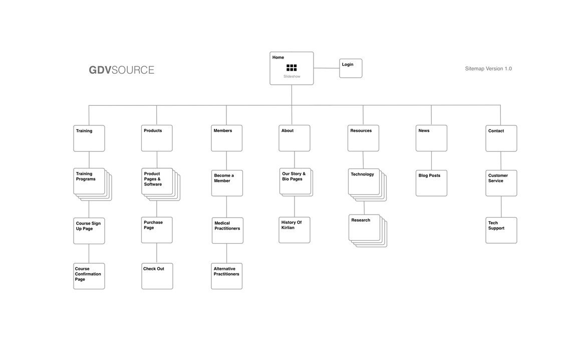
Slide 9: Site architecture Version 1.0 showing top-level / secondary navigation. A moving document that will develop further out over time
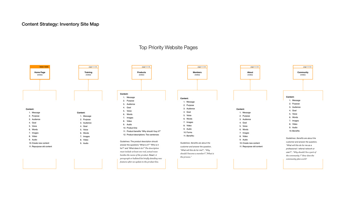
Slide 10: Devised a Content Inventory map for client. This shows what top-level priority content should go on each page as well as purpose of the suggested materials. This was one of the main UX issues with the preexisting site that the client needed clear direction on.
Step 5: High-Fidelity + Front End
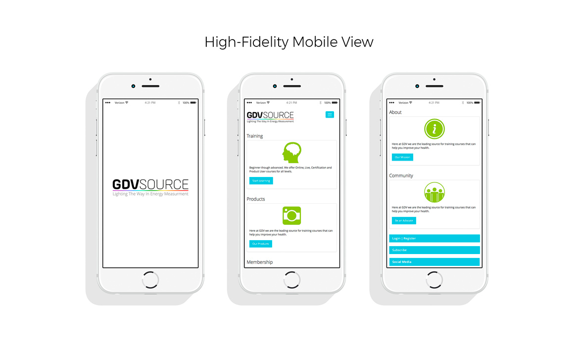
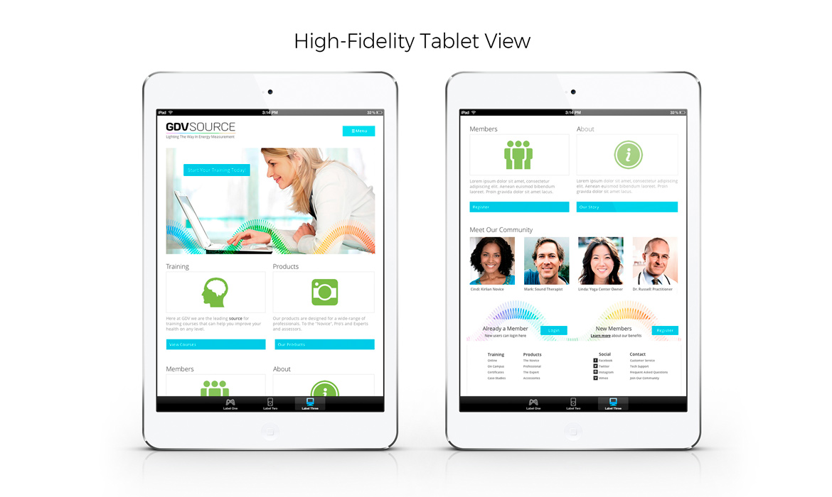
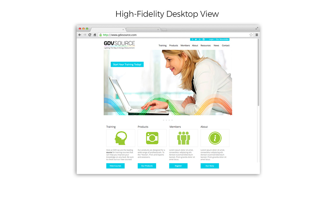
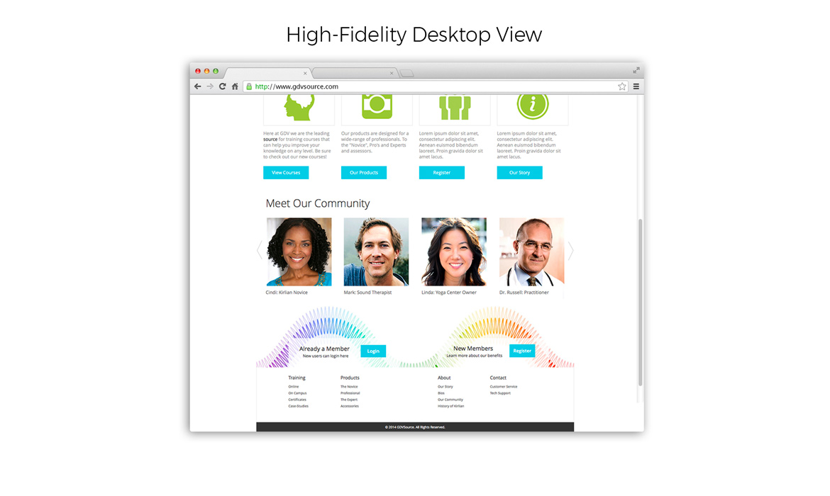
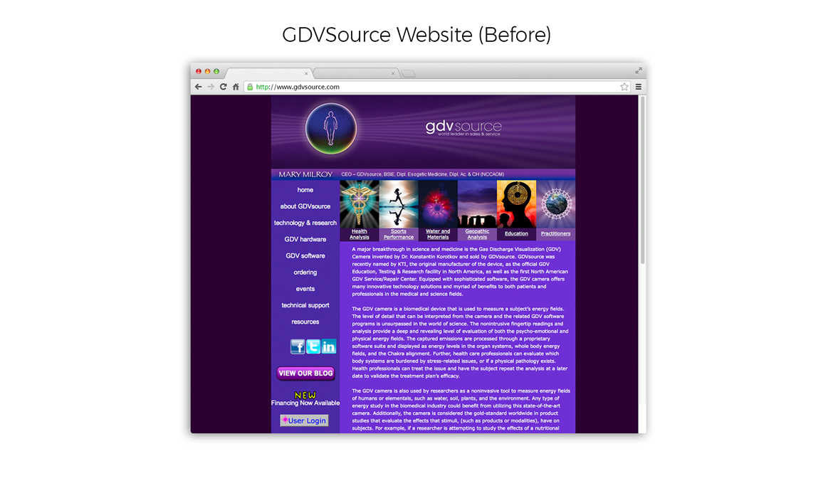
Step 5 consisted of turning the medium-fidelity prototypes into a polished, high-fidelity site with a new refined UI and user flow that was now viewable on any device. Below are some examples of the new refined site on mobile, tablet and desktop. I note that on slide 5, I show the "old" GDVSource site as “before,” so you can see where this project was and where it is now after all this work had been completed.
Front End: As a part of the new site build, I wanted to take the prototyping phase to another level by turning the high-fidelity design into a fluid mockup for development. It was clear that the client was happy to finally see a view of all the work that was done to reach this step. My process was done by downloading an HTML5 (initializr) boilerplate with embedded bootstrap 3.0 styles. I set forth on coding and developing a working fully responsive version of the site. Some extras that were added were google fonts, custom css styles and transition / hover effects. I also used SVG logo + icons for retina displays and implemented a slider carousel for the community section that you can view on the home page for tablet / desktops only. On the mobile I chose to hide some features for a speedier download time.
View Responsive, Front-End Page
Step 6: Results + Next Steps
A successful conclusion of GDVSource’s new rollout will be governed by additional allocated funds and continued user feedback to get it right. It is imperative that investors come onboard to support and create Kirlian technologies that are both beneficial to health markets and enjoyable to use. Solving these core needs of business / users was of great help to the evolution and growth of a better designed experience, but way more is needed in making a great "esoteric" product come to the forefront of the US market. The potential is there, and I believe there is a hidden gem in the energy measurement field just waiting to be unveiled.
Next Steps:
a) Further development of GDVSource’s business model
b) Create Brand system
c) Content strategy: Voice / tone / page purpose
d) Content strategy: Producing new / revised content
e) Design: All other template-based pages for entire site
f) Ongoing research / surveys / usability testing / design iterations
g) Visuals: Brand guidelines, style guides, typography, color and imagery
h) Branding social and community channels
i) Budgeting for advertising / marketing materials
j) Programming and testing
k) Soft launch version 1.0


