Project iamHeart…
Overview
IamHeart is an educational institute dealing with human wellness—specifically, heart meditation. It is a non-profit educational corporation founded in 1989 and run by a Board of Directors. It was founded by two meditation teachers, Susanna Bair and Puran Bair, who live and operate out of Arizona. This institute for applied meditation has published several books by Random House, and has one of the only accredited meditation university programs in the country, called, The University of the Heart (iamU), for further study of heart meditation. It also offers group retreats, private retreats, mentoring and web courses.
The What
• What was designed: Redesign of an existing website (Responsive)
• UX problems being solved: Site Accessibility, Content, Target Audiences, Site Architecture, Business Prioritization, Layout, Visuals & UI
• Approach: Waterfall (Discover, Define, Design, Develop, Deploy)
• Tools Used: People, Pen & Paper, Audio memos, Screaming Frog, OptimalSort, OmniGraffle, Adobe illustrator, Photoshop, Sketch, InVision
The Who
• Client: IamHeart
• Target audience: Health conscious, heart centric, meditation practitioners and participants of all levels
• Industry: Health & Wellness / Meditation
Process
My decisions were influenced based on what matters most to the users. Each project has its own set of problems to solve and its own solutions or results. This leads me into this project scope. Sometimes solving big problems is a more singular approach (agile), but this assignment needed to be broken apart, dissected and reassembled again in order to structure a healthy website redo. As was also the case with my involvement in the GDVSource project, this project, too, was multi-tier in disciplines and complexities, as I had to act as product person, gathering key business requirements.
Addressing all Brand strategy, UX/UI and Visual Design, I decided on the "waterfall" approach, feeling this was not one centralized problem I was solving, but many scattered micro problems within the institutes ecosystem. These core problems needed to be funneled out to reach a final, up-leveled outcome. Processes included: Step 1) Discovery: Gathered business needs and analysis. Step 2) Researched and gathering insight from founders, stakeholders, internal teams and users, as well as conducted competitive audit and established personas. Step 3) I defined top-level tasks, user flows, sketches, information architecture and content strategy. Step 4) Consisted of medium-fidelity interactive prototypes, paralleled with high-fidelity and visual design.
In addition, I had to guide and educate the institute on understanding “who” its audience was, how implementing user needs and goals into the new experience was mission critical to success, as well as defining their brand positioning. This was all vital to garnering a larger wellness market and enrollees, which was the primary business goal of the iamHeart institute. Other contributors were a project manager (located in Swizerland), a developer (located in Bolivia) and founders, marketing and internal people (located in Arizona, US).
Problem Statement: 1) Non-responsive site for accessing on mobile / tablet 2) Hard to navigate pre-existing website to understand home page (brand messaging) as well as finding educational courses and product details & benefits 3) Site architecture and taxonomies are convoluted and congested, making it unclear for users to navigate site 4) No structure for online educational programs / course levels and on-boarding online courses 5) User interface / UI is disjointed and nonuser-friendly, with no real CTA (call-to-action) interaction 6) Too much (non relevant) content displayed, causing "cognitive overload."
Hypothesis: 1) Clear business value prop and benefits for product + services 2) Prioritize the primary goals of the business + users 3) Develop a user-centered responsive website so customers can access on all devices 4) Improve visuals and UI 5) Streamline the educational programs and iamU online enrollment process.
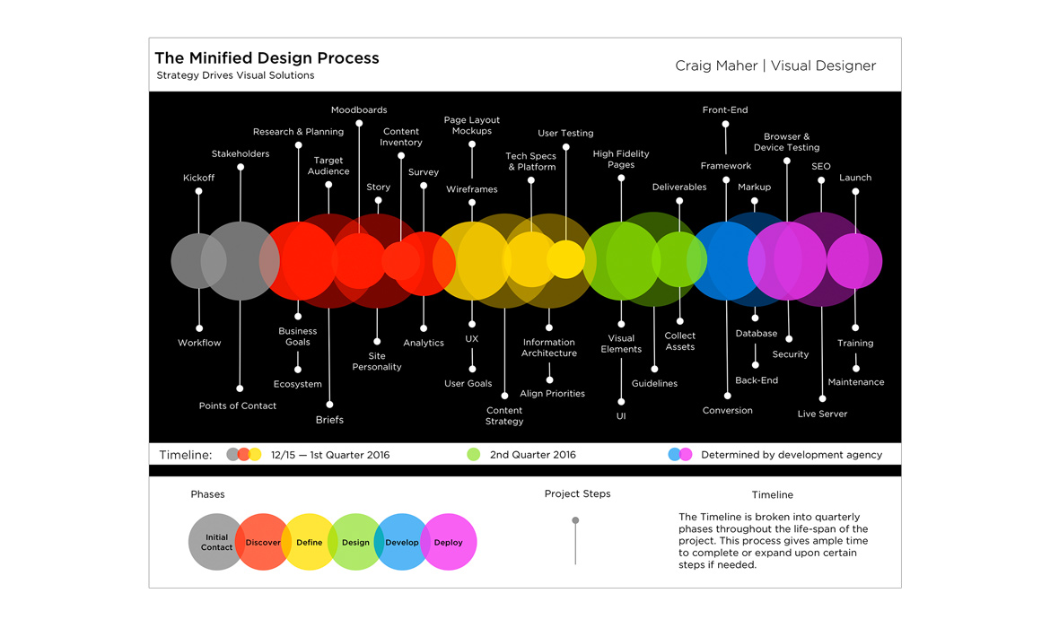
Below is my custom diagram of my waterfall process (Discover, Define, Design, Develop, Deploy) with vital steps that I submitted to the client so it could visualize what is involved in a redesign—and the steps—to get to a successful outcome.

Step 1-Discover: Business + Brand
Discover was the first phase I took in deep-diving a full analysis to obtain knowledge of iamHeart's core needs and goals, but also looking at its model, mission, vision and story of the organization. Understanding the prime benefits of "why" this method of meditation was worth practicing and "who" it was tailored to was critical for both the client and in understanding / clarifying. Further discover was getting the founders involved with a short brand questionnaire. It was an inviting way of gaining essential insight into the way they see themselves. They really enjoyed the experience of having to really think about the responses they give me which, I believe, only helped in opening their eyes in an objective way. Examples of questions I asked in the brand brief were: 1) Where did they see themselves heading over the course of next several years? 2) How did they define their brand personality? 3) What is their brand promise? Like many robust undertakings, I feel having a good amount of research to validate design and base a strategic direction off of, is key to setting a new charter. I also discussed with the founders their expectations and asked them what success looked like for them. I felt the importance of initiating clear communications and going in depth in the beginning stages was helpful in avoiding any scope creep and red flags of keeping to the project timeline on track, as well as reaching a successful outcome.
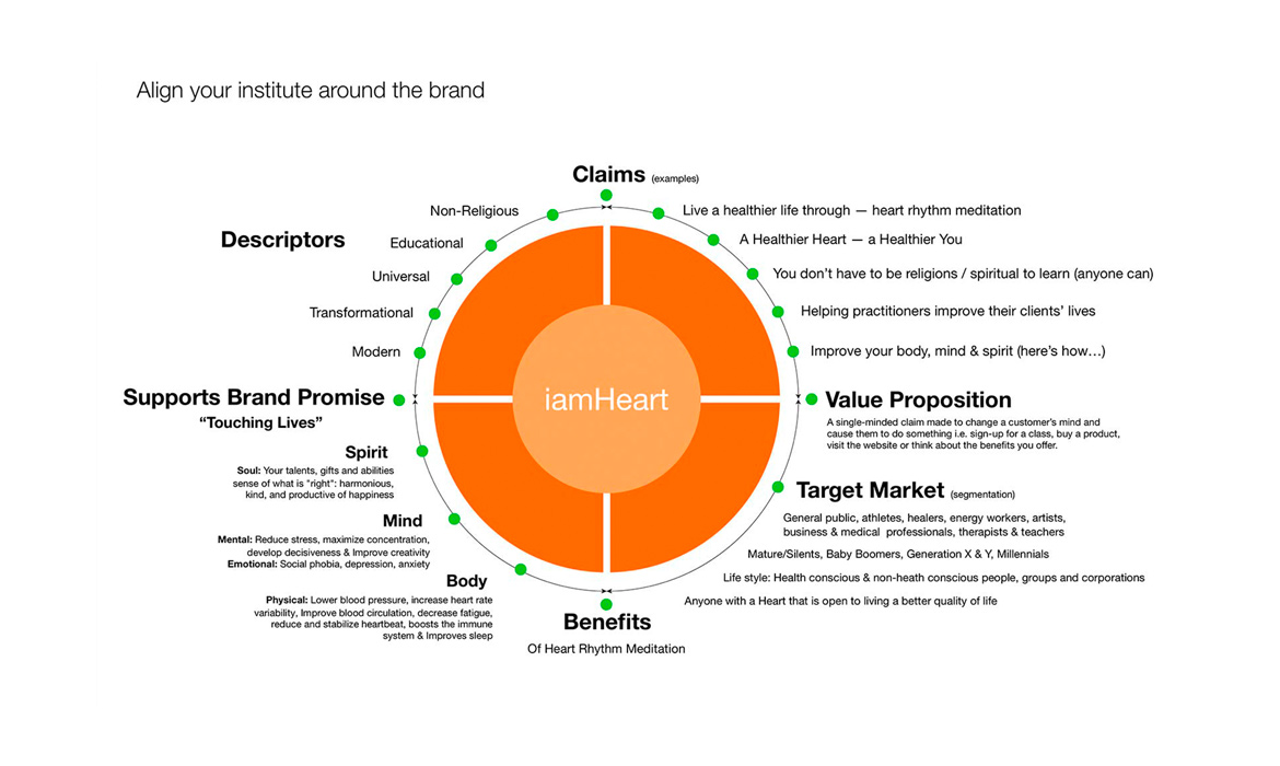
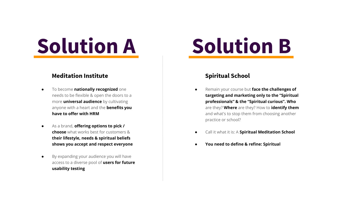
Below are detailed first steps taken in that discover process as well as slides 5 & 6 which shows how I educated iamHeart with infographics to help visualize and align the institute around its brand, and the solution paths I proposed.
Brand Brief Topics: Background and Aspirations, Brand Personality, Target Markets, Competitive Landscape, Products and Services
Prioritize Business Goals: Increase revenue by acquiring a higher amount of new enrollees for both web courses and university admissions. These goals were found to be high-level revenue drivers for the institute.
Content Inventory: 1) Conducted an audit on the preexisting site 2) Created excel spreadsheet to define each piece of top-level and second-level page content. I broke this into three topics: a) Aligned: Relevant b) Somewhat aligned: Could be reused c) Not aligned: Quarantine / rewrite. This audit helped me to see that the preexisting site had over 200+ pages, five levels deep and were only accessible by inputting a google search of that indexed content, instead of via the main site navigation.
Value Proposition: IamHeart offers a 2-year degree program in Heart Rhythm Meditation (HRM), the only one of its kind.
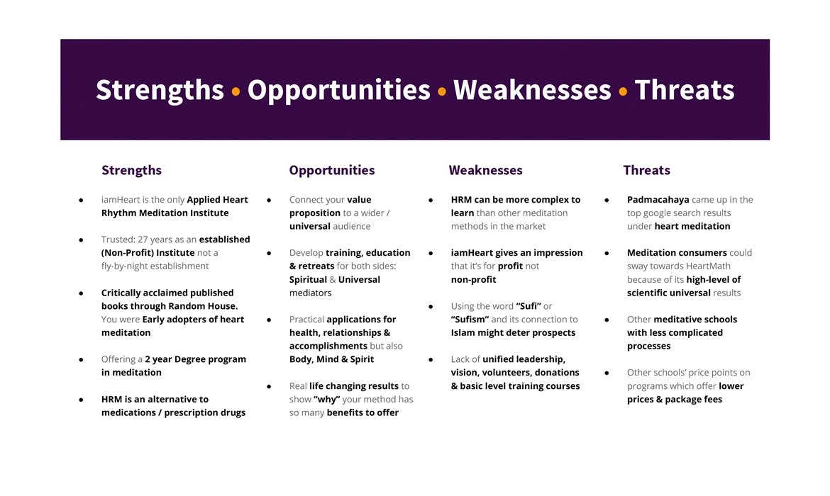
S.W.O.T. Analysis: Clarified strengths, weaknesses, opportunities and threats in the market that are shown below on slide 4. One major find was the fact that "everyone has a heart," so the marketing opportunities were fruitful and endless to the majority of common people.
Project Phase Challenge: Getting the founders to see in omnichannel and not having "myopia" about their new audiences.
Step 2-Define: User Research + Personas
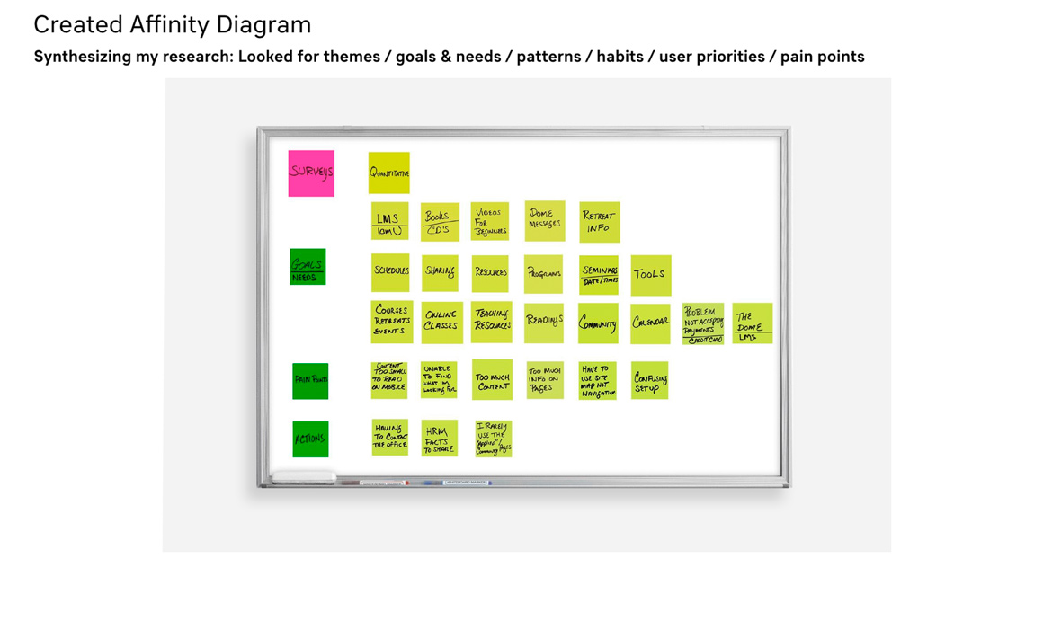
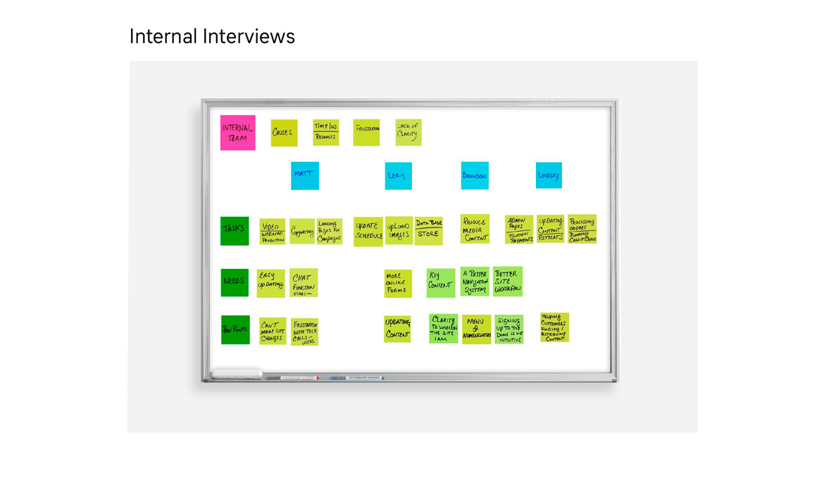
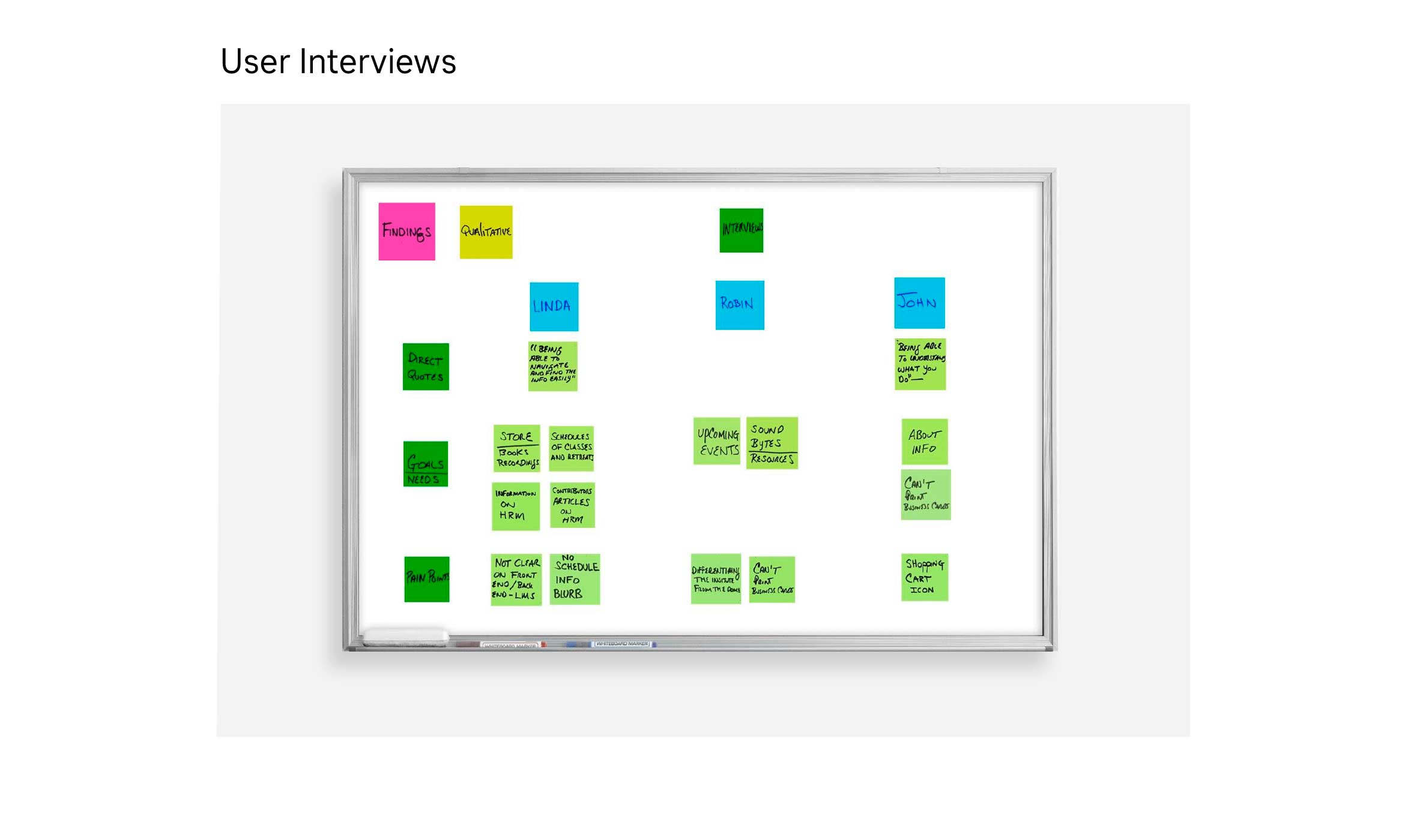
Having the documentation that supports and justifies "why" I'm designing and making design decisions revolve around iamHeart's target audiences, and are anchored in user stories that helped me to shape what was going to be needed on a business-to-user level. In step 2, I defined targeted users, ran surveys, conducted qualitative interviews and created personas that will be used for centralized focus for this website transformation, as well as helping internal teams to focus on “who” they are communicating to. Below are the slides that show this step. I feel much more research and user testing was needed, but this lean approach was sufficient in collecting important user insight based on timeline and budget instead of subjective assumptions.
Audiences included: Health conscious, heart centric, meditation practitioners and participants of all levels of healthy and non-healthy lifestyles
Some Interview & Survey Questions: 1) What is the primary reason for your visit to iamheart.org? 2) What are your meditation needs & goals? 3) What page or pages on the website are important to you and why? 4) Do you access the iamheart.org site mostly for personal reasons, professional reasons or academic ones? 5) Do you experience any problems when accessing the site? What kinds of issues? 6) How might a meditation site benefit you? Make your life better, etc.? 7) What are some issues you encounter when gathering information about HRM or iamU? 8) What sites do you visit or use for getting your meditation needs met?
Research Findings: Users needs were 1) Being able to enrolling in online web courses with proper locations / calendar and dates 2) Understanding navigation and usable content clearly 3) Having basic level classes to take for new people interested in HR meditation 4) Issues with content, mobile viewing, login and resources.
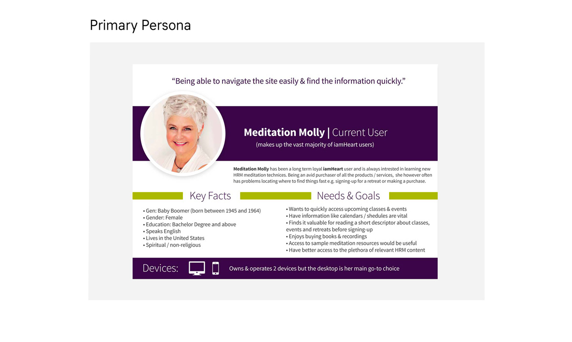
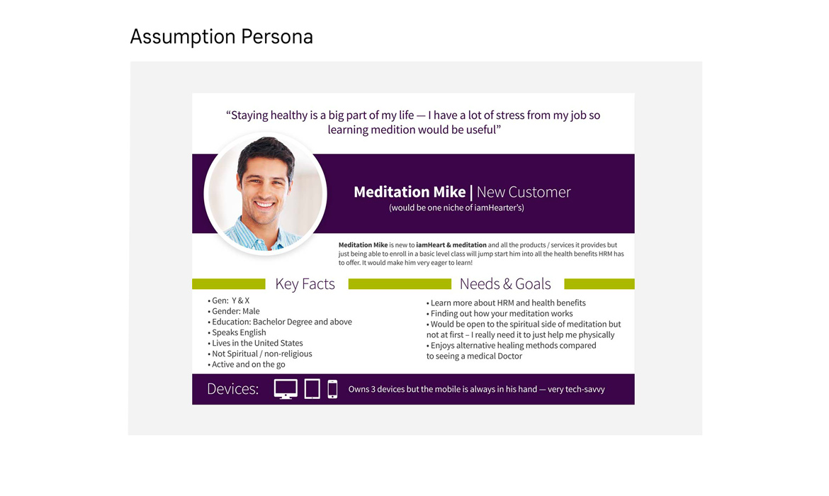
Personas: Two were created. 1) ‘Meditation Mary,’ an archetypal user whose goal was to sign up for courses and events 2) ‘Meditation Mike,’ a new consumer needing the health benefits that HR meditation has to offer and not the spiritual / religious aspects.
Product Core Focus: For phase one, I choose to focus primarily on both meditation Mary's and Mike's needs for both iamU's home page / administrative enrollment process and iamheart’s home / online course signup and checkout. Features included: Calendar, dates, follow class, sharing, checkout (details, payment, conformation), location and chat capabilities.
Step 3-Design: Sketches, Wireframes & Flow
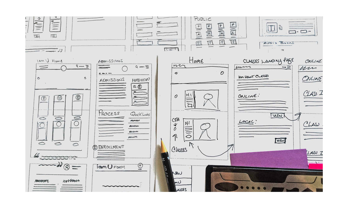
After my paramount meeting with the founders to present the findings of steps 1 and 2, it was time to start turning research into visual solutions shown with my low-fidelity sketches below. The main problems I found for the business side were the revenue-generating sections and for users to navigate through large amount of content to reach their main goals. In fact, there was so much content being published and uploaded to the site (that didn't align to their users) that both internal / external users found the frustrations of "cognitive overload" to locate anything beneficial. Below are the behind-the-scenes of one example of my drawings of thinking through the iamU admissions process with the online form application + submittal process.
Overall Solutions: Part one of this was deciding on solving a few core issues instead of a number of small, ill-conceived outcomes. Educational channels and increasing sales are its brand drivers and business high-level goals. I proposed the approach of building out and solving users’ screens and flows needed to complete users prioritized tasks first. Part two was unifying, teaching and introducing a content strategy action plan on how this is of great importance in a way of producing + implementing small chunks of relevant material for a mobile-first approach, and would be key in aligning tone and voice to both personas / brand, but also reducing "cognitive overload" for users. Getting the founders to agree that there was "too much" content and fluff that no user was going to understand the benefits or brand story.
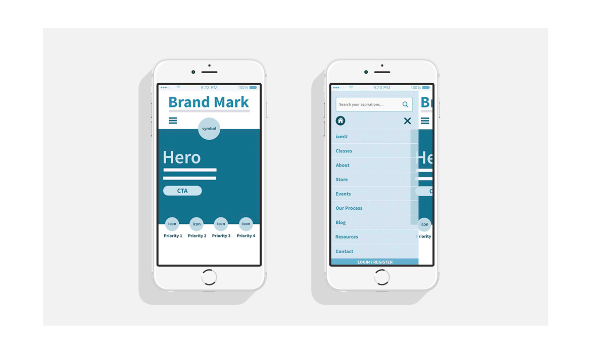
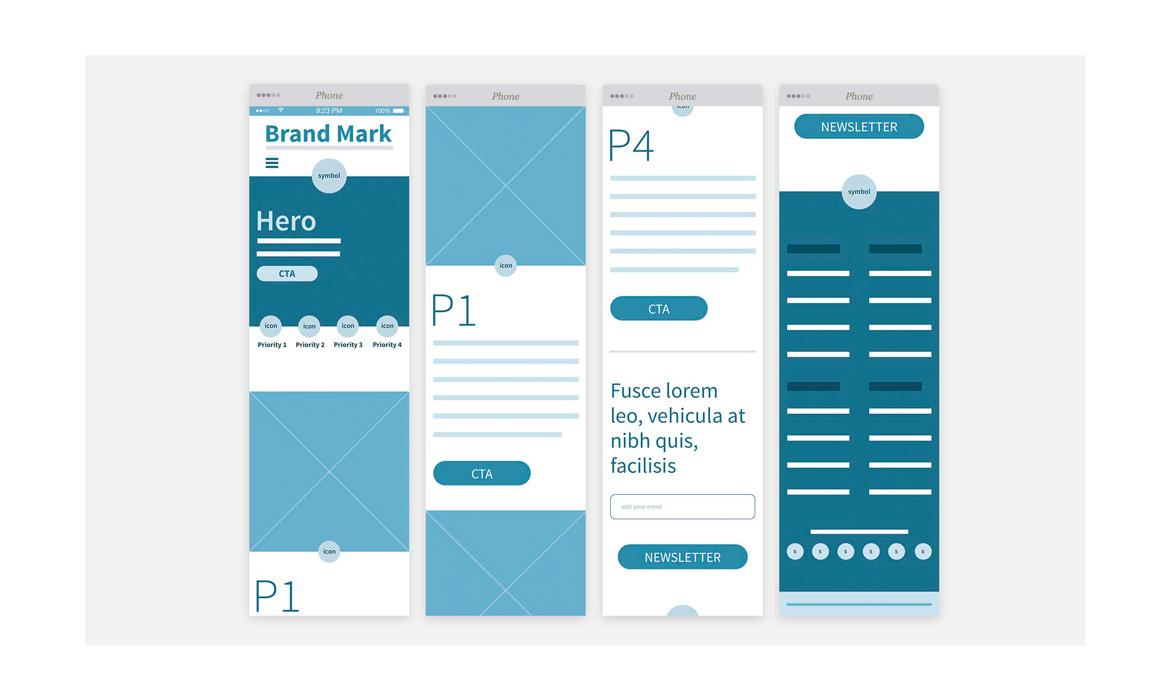
Mobile First Solutions: Based on user tech habits and google analytical findings, as well as the fact that the majority of global people are using smartphones over desktops, now helped me to decide on a mobile-first approach of solving the home page problems first. Having a "less is more" simple usable interface with clear CTA and understandable navigation was a good start. View the mobile wireframes on slide 2 & 3 with a clickable version link below.
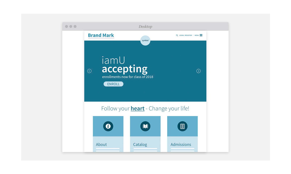
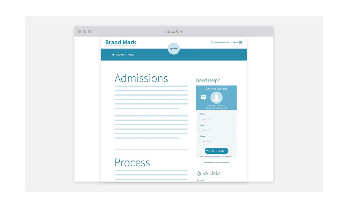
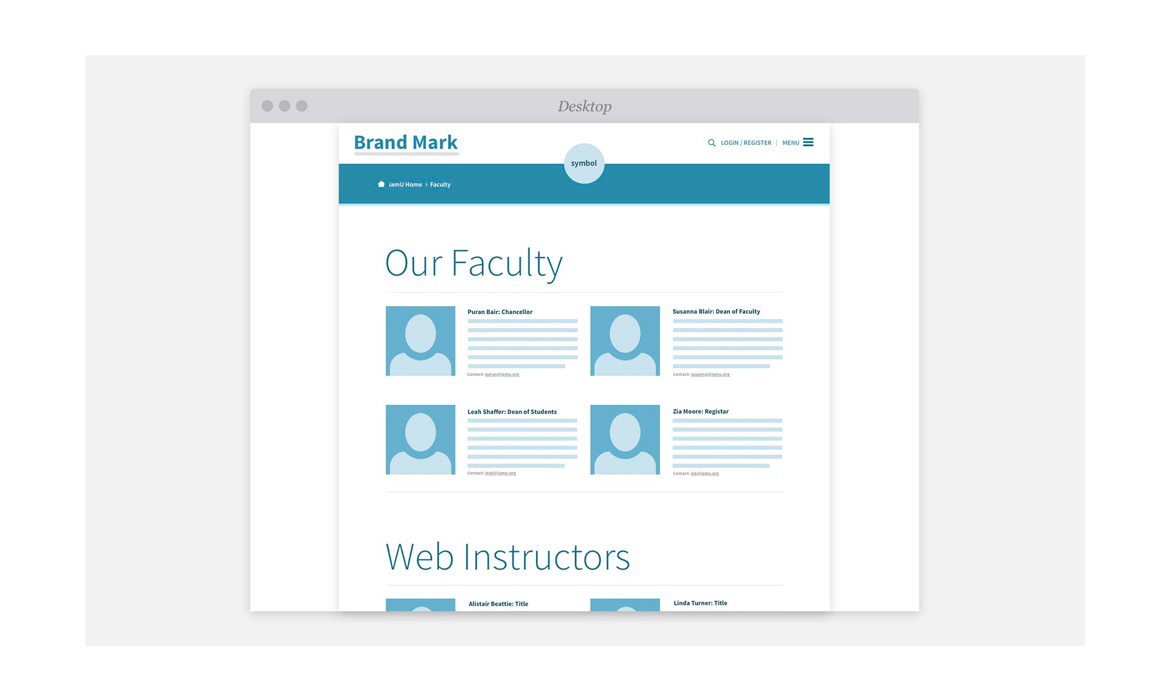
Medium-fidelity Wireframes: After preliminary sketches, the next evolution of the prototypes process was starting to design structure and prioritize the important valuable content in a hierarchical, "above the fold" position. I achieved this by utilizing Bootstraps Responsive grid for multi-column layouts (see visual design), and it was critical for working out fluid device view ports. I started with small screens first, then designing outward to tablet, then large desktops. I also started to incorporate small CTA lines so the client and developer could start visualizing output. See samples on slides 2 — 6.
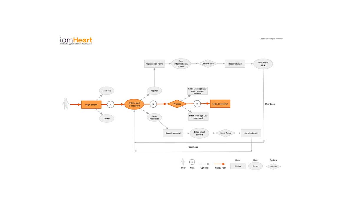
Login user flow: Slide 7 shows a user flow for the iamheart login process. This was important for development to understand system decisions and for me to start to design the GUI that lives on those display pages.
View Mobile Wireframe
View Sign-Up Online Wireframes
View iamU Wireframes
Step 4-Design: High-Fidelity + Site Maps
The slides below show the evolution of design transformed from medium-fidelity, and feedback I received from users and development. These are what I consider to be high-level prototypes that are interactive "clickable" with core user features that need to be communicated. They have a more defined, lucid hierarchy of UI, white space, layout / grid, content strategy and the typeface Hurme Geometric Sans, (which aligned to the brand guidelines, but also was chosen for characteristics of being highly legible on smaller mobile screens). They also convey simple CTA icon buttons to guide users on next steps, etc. These screens are much like architectural plans in that they are designed with a bluish hue to indicate that they're in the mid-level phase of development, and further usability testing would be needed before high-fidelity. I invite you to "click through" and get a feel of this experience in the link below. This step finally fleshed out issues of accessibility, findability, usability, desirability and content strategy.
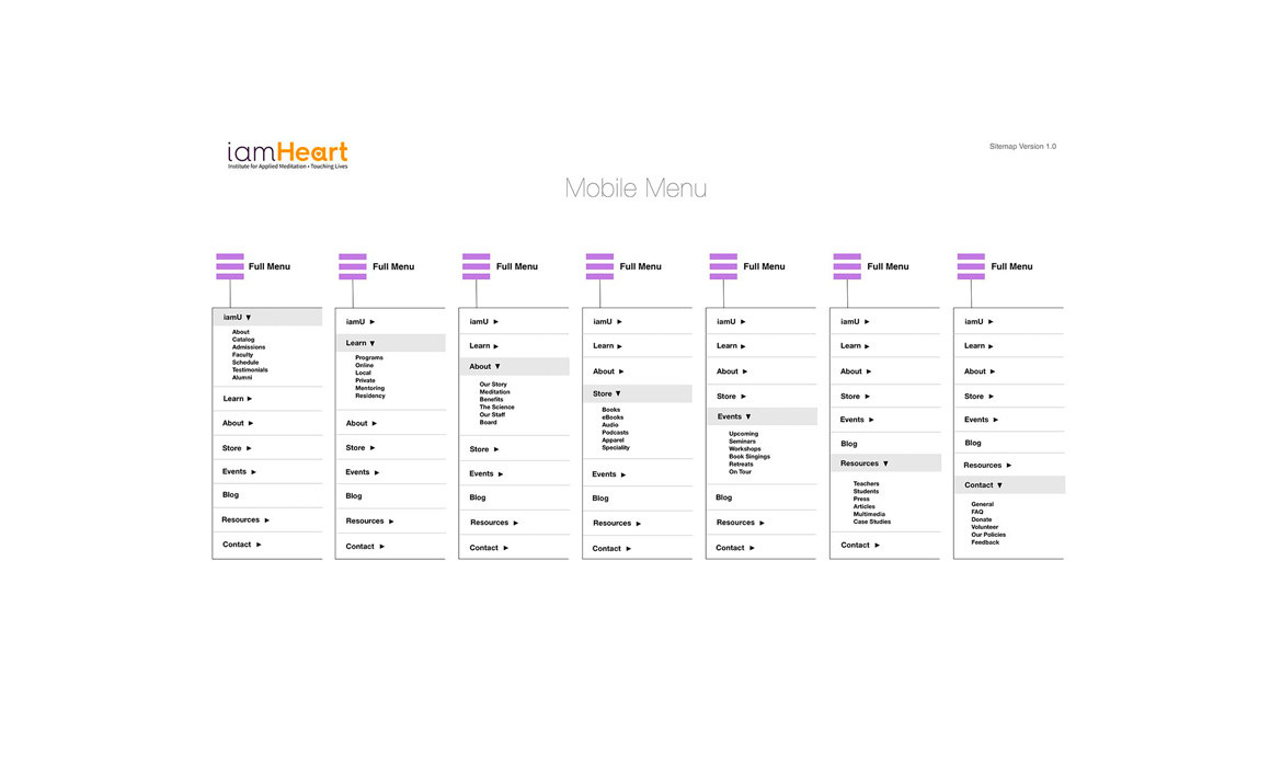
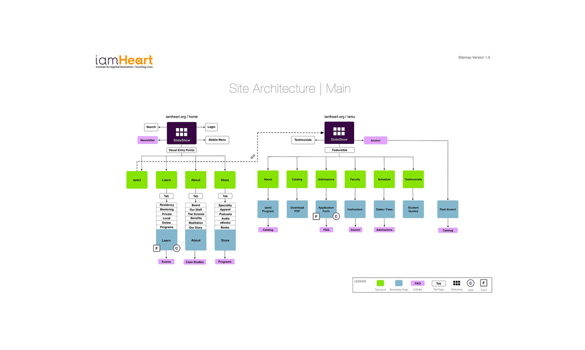
Card Sort: In step 4, I also wanted to establish how users would categorize items accordingly. This was achieved by running an open card sort with an online tool called OptimalSort, which helped me understand and bucket content with proper nomenclatures / taxonomies for the beta rerelease of the new website. The results of this process structured primary and secondary site architecture for mobile / desktop.
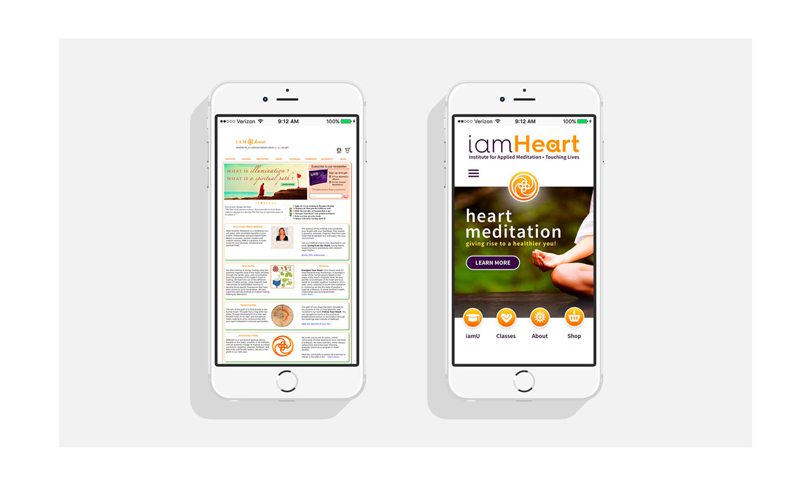
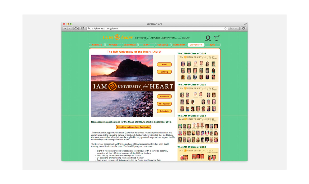
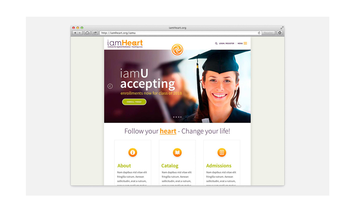
Slide 1: Shows the before & after of the old site on mobile (left) and the new recrafted high-fidelity design (right)
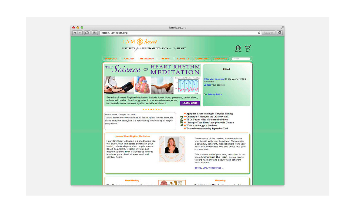
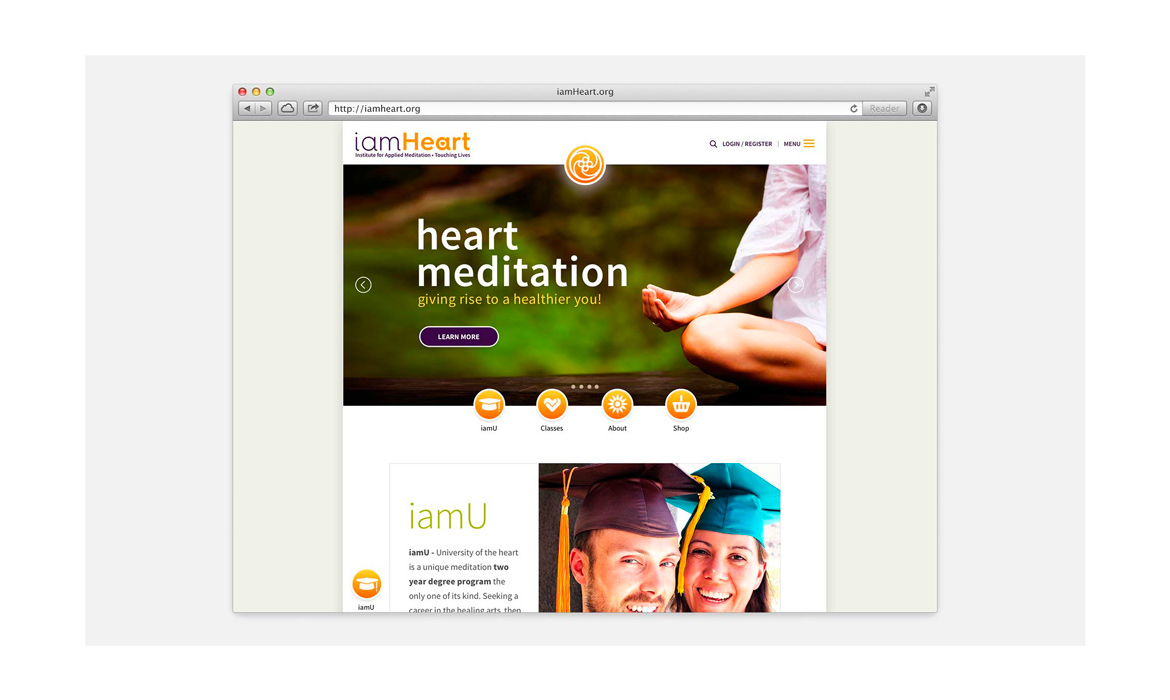
Slide 2—5: Shows the old site for large screen desktops and new site for large screen desktops
Slide 6: Site architecture for Mobile
Slide 7: Site architecture for Main Site (iamHeart / iamU)
View Mobile High-Fidelity
View iamU High-Fidelity
Step 5-Develop: Deliverables + Next Steps
Collected, exported and set all deliverables assets to via Sketch and sent to developer including: PDF of finished pages, SVG logo, @2x retina imagery, icons, border css styles, hex colors used.
Challenges and Takeaways: 1) Getting founders onboard with understanding the value of budgeting out for UX. 2) Getting everyone to have open communication and work toward a company unity 3) Getting founders to listen more to internal teams’ needs and giving up tasks to trained professionals involved in the project to trust in their guidance. For me personally, I had a real passion behind the company’s vision in helping people to feel better about themselves and live a better quality of life through their services offered, but I still think this got them to an overall better place than being in the dark about a website redo. My final thoughts are, if you design a site for everyone, you designed it for no one, which I hope resonates with this client moving forward.
Recommendations:
a) Refer to the brand as an “institute for spiritual studies” or institute, not an “organization”
b) Empower / hire a content writer. Have a system in place for developing the right content guidelines (audience, voice, tone), editorial calendar, governance & maintenance
c) Custom-design flat universal infographics for scientific sections that match the brand colors, styles, etc. This would help claim exclusivity over iamHeart’s methodology
d) Devise an understandable system of its process, because it will match the form, function & beauty of the site — less is more for web
e) Provide main slider images that show “heart rhythm meditation” or the positive effects of what that feels like. Need to show if we’re to come across the site and weren’t familiar with the institute, you would be able to figure out it has something to do with meditation
f) Understand website positioning should be about what iamHeart’s meditation process is, and what it can do for helping people (value proposition) than discussing the origins of (Sufi-ism)
g) Perform ongoing research / usability testing / design iterations
h) Design a “Spirit brand book” that encompasses the brand’s essence with beautiful imagery and descriptor words. This can be used to send to prospects looking to take classes or sign up for iamU. Hire a photographer to capture the process, school, teachers, community, founders, retreats and benefits of being one with iamHeart.


