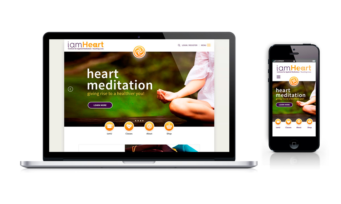
iamHeart Visuals
Overview
IamHeart is an educational institute dealing with human wellness—specifically, heart meditation. It is a non-profit educational corporation founded in 1989 and run by a Board of Directors. It was founded by two meditation teachers, Susanna Bair and Puran Bair, who live and operate out of Arizona. This institute for applied meditation has published several books by Random House, and has one of the only accredited meditation university programs in the country, called, The University of the Heart (iamU), for further study of heart meditation. It also offers group retreats, private retreats, mentoring and web courses.
The Objective
• The Purpose: To create a design language that elevates, communicates, and stimulates users of iamHeart's website & ecosystem
• Design problems being solved: There was no clear visual guideline of elements that expressed the brand personality, tone & messaging
• Process: Visual Research & Ideation, Mood Board, Logo Design, Typography, Color, Photography, Iconography, UI, Layout and Grid
• Tools Used: Adobe illustrator, Photoshop, Adobe Kuler, Color Oracle, Bootstrap Grid System and My Fonts.com
The Audience
• Client: IamHeart
• Target audience: Health conscious, heart centric, meditation practitioners and participants of all levels
• Industry: Health & Wellness / Meditation
Visual Analysis
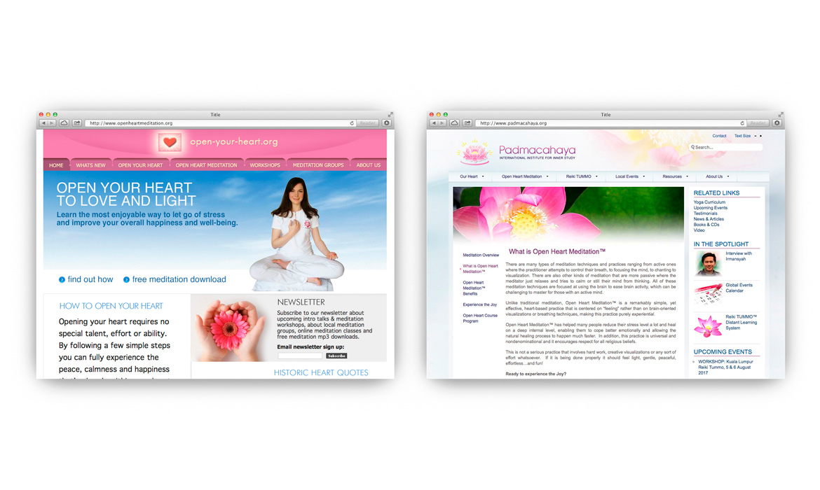
Step One — Research: After my UX process was completed, I started to discuss with the client next steps in the evolution of their product scope. How do people perceive their brand in five seconds? And how would the right visuals support a clear personality, tone and message? This was key in a world of online brand choice. We both agreed that the visuals were mission critical in the perception of the institute’s sustainability into the future. This process started by researching visuals / identities of other HRM meditation websites to make sure we differentiated and up-leveled the product over other competitors, staying clear of design clichés.

Mood Board
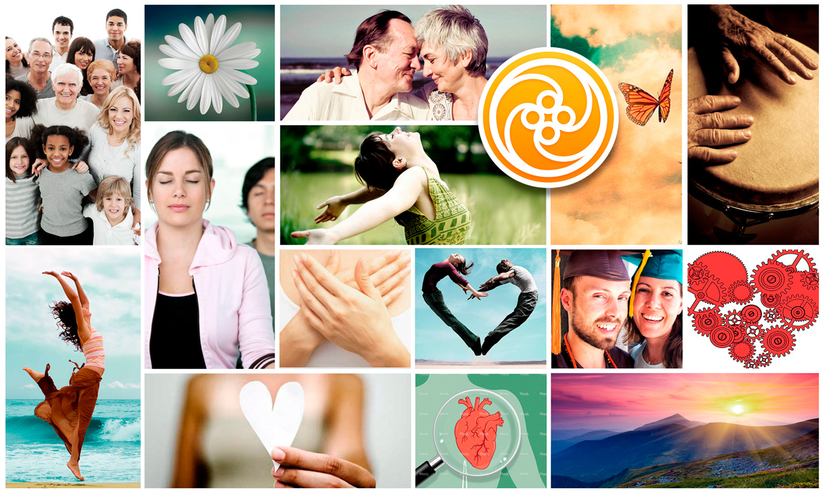
Step Two — Inspiration: Below is the "aspiration" board which I created for iamHeart to gather visual direction and explore the ethos of the institute. These images reflect color, emotion and mood to help create an overall vision for everyone involved in the project — before we might end up moving in the wrong direction. I asked the founders in the discovery phase to supply me with some adjectives and nouns that best described their company's personality / character. These words helped me craft a system of clarity while having fun in the process.
Descriptors: Modern, Transformational, Universal, Educational, Sacred, Harmonious, Scientific, Community, Magical and Non-Religious.

Logo Design
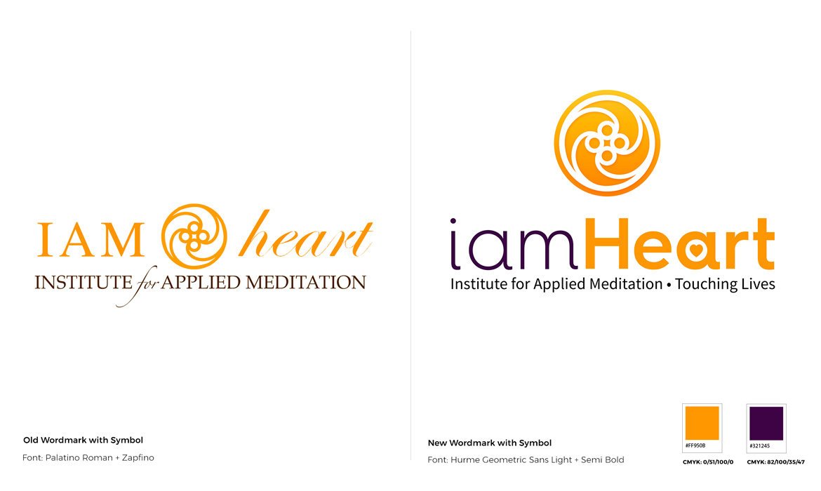
Step Three — Identity: One word that came forth in the ideation steps was “modern.” This was the direction the institute wanted to move towards, a more "centered" grounded feel, not a disjointed mishmash of fonts thrown together to create discord. Again, being a lover of logo design, I wanted to create something simple and that could be legible to read in small screen devices first, then improves as it scaled up in size for large screens. I also wanted to keep the existing orange but add a good amount of color contrast to differentiate the "iam" from the CamelCase "Heart." The new logo system could be used as a wordmark, separate or as a bigger unit incorporating the pictorial mark over the top, resembling the sun rising. Defining a new tagline was also part of this phase, which pushed a clarifier, "who are we" and the brand promise, "touching lives," at the same time. I felt it was a nice solution to the overall product.

Typography
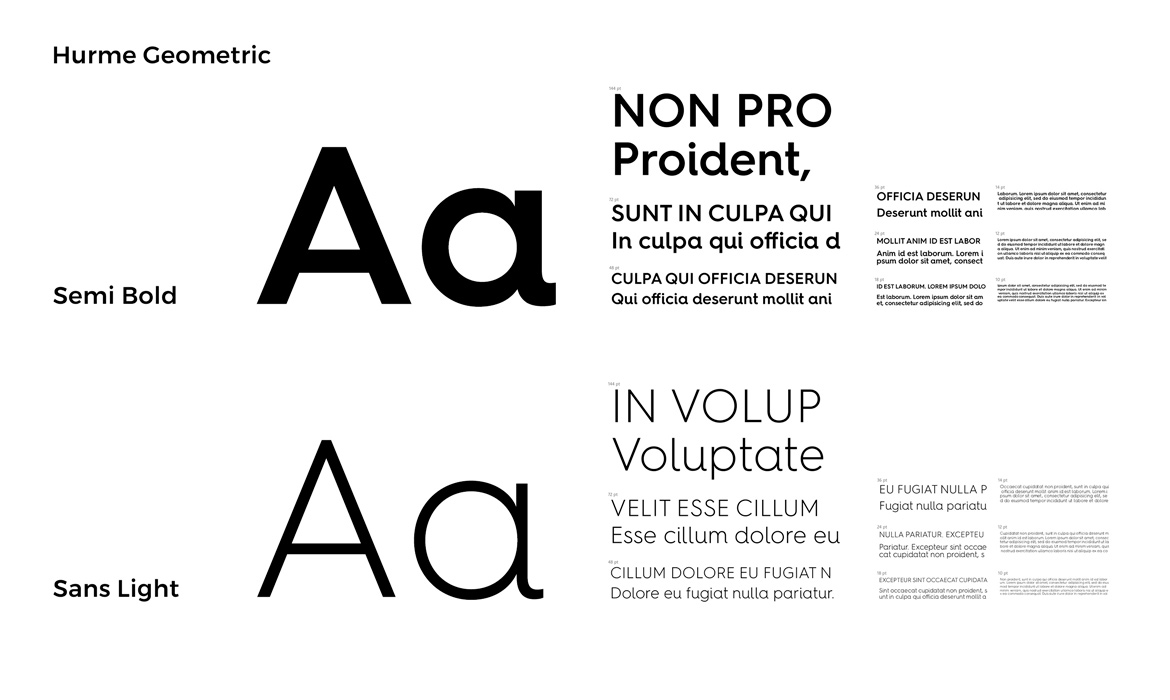
Step Four — Selecting Fonts: Keeping in line with best practices for screen-based designs, readability and budget issues were of concern here. Bringing forth a new modern typeface for headlines, H1 and Subheadings were carried over from the new logo design shown above. Marrying (Hurme Geometric Sans) a modern font family with beautiful curves much like a human body mixed with the highly legible, google typeface, (Source Sans Pro) created a nice combination and a high-level harmony moving forward. This took the old product into a new era of elevation and lifted it out of the stuffy, overused, "Palatino past." Serving up new cloud fonts with quick responsive load-times for mobile / tablet devices was something that helped me make proper decisions set on both business and users alike.
Website body type: Google Source Sans Pro

Color Palette
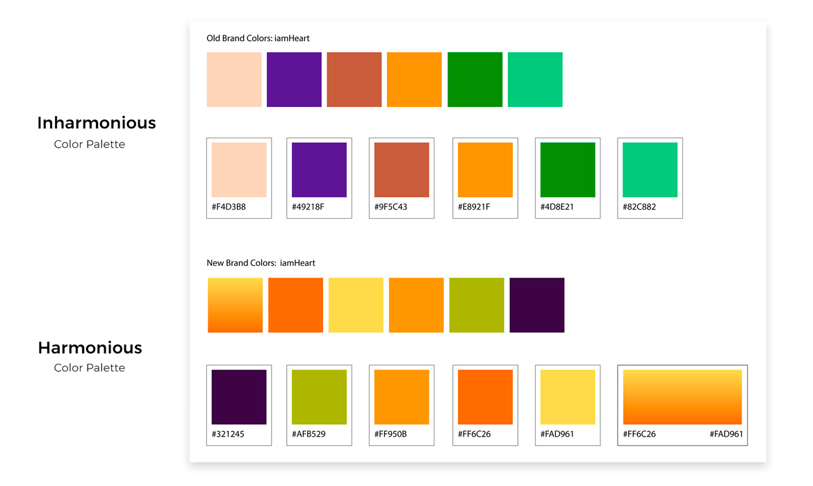
Step Five — Color Theory: Keeping in line with the original iamHeart orange color as a brand base, using the color wheel I created a new harmonious palette using triads, complementary and analagous shades to be utilized throughout the User Interface. This was shared with both internal teams and development. My color logic is listed below.
Orange: Attraction, success, encouragement
Purple: Creativity, power, and magic.
Green: Growth, hope and natural
Yellow: Intellect, friendliness, optimism.

Photography
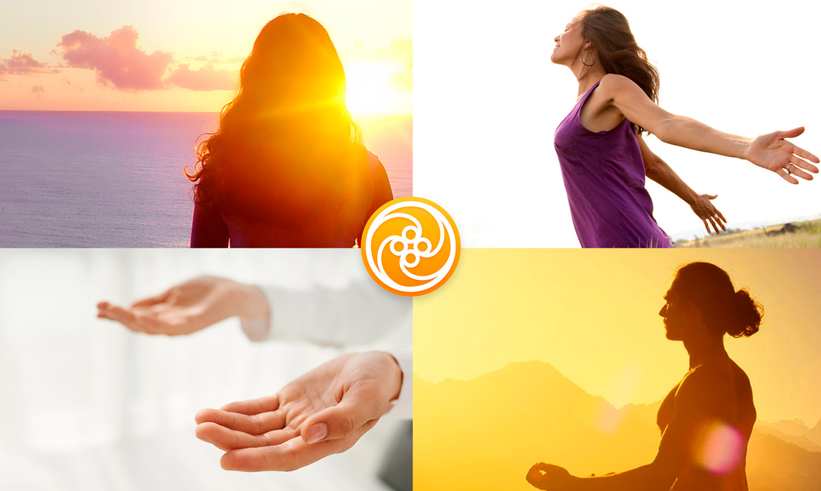
Step Six — Image Recommendations: Pulling from inspirational images in the mood board, I wanted to set a standard for what types of Hero imagery would be showcased on the home page, as well as other pages and other applications. "A picture is worth a thousand words," and the benefits of HRM meditation need to be expressed, so communicating these types of images were vital to the website’s target audience. It was a meditation site, so leaning on words such as Transformational, Universal, Sacred, Harmonious helped set up a content usage guideline that was not implemented prior to this project and should be governed moving forward.

Style Guide | UI Kit
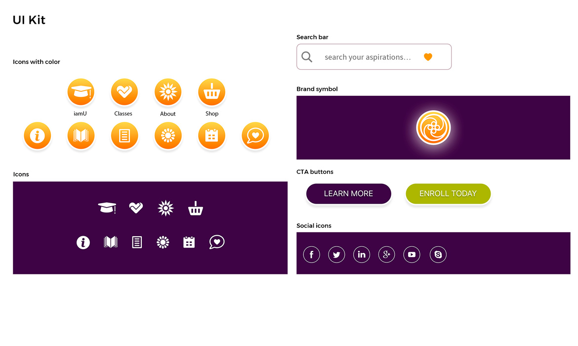
Step Seven — Reusable Elements: Used for the UI interface and were researched based on the specific sections of the website. They were an important element to aid in helping the user tasks by implementing intriguing clickable buttons that would become more recognizable over time. I felt these graphic components needed to work as a collective system and not just a random set of icons, but as part of the bigger brand personality. Used for a quick access, this repository UI kit could be repurposed and built upon as the product grew in scale, as well as it acting as a guideline for development and internal marketing.

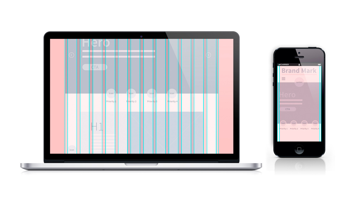
Grids: 12Col | 1Col
Step Eight — Structuring Layouts: I chose to work with the bootstrap front-end framework not only as it works on the number 12 –which can be divided numerous ways to create fluid custom layouts—but it was also the developer’s choice to use this framework as well. Below are my examples of implementing both medium / mobile devices and how at times I wanted to break the grid to create interesting aesthetics. For the large screen, I used: Gutter width 30px and content column 1170px with a margin to equal 1200px. For the mobile screens, I used a combination of : 1 col, 2 col, 3 col and 6 col. Below are some examples of working with the grid.

Final Visual Solution
Step Nine — Bringing it all Together: This was an exciting moment for me since this was a big undertaking and deep-diving with the Brand brief, User Experience, research, business priorities, value prop, content strategy, IA, prototyping, user testing and finally seeing the”icing-on-the-cake” with all these visual design elements added. As an additional rule of thumb, I like to create an overall harmony of GUI / Graphic User Interface elements by incorporating and dividing a golden ratio to add that special touch for the final deliverables. This treatment of universal scale adds a humanistic proportion and much like a great piece of art, it lets the composition breathe and become a naturally desirable product to its intended audience.
