Project nūtrious…
Overview
Nūtrious is a Health & Wellness startup that focuses on empowering people to live a healthier quality of life through our personalized, managed products and services We create what’s good for you — naturally!
The What
• What was designed: Nutritional advisor / native utility app for iOS
• UX problems being solved: Suggesting advice for app user 1) Health conditions 2) Remedies 3) GeoLocating goods and services
• Approach: Agile (Focused on solving a singular product need)
• Tools Used: People, Pen & Paper, Audio memos, Marvel Pop, Adobe illustrator, Photoshop, Sketch, InVision
The Who
• Client: Nūtrious — Enterprising startup
• Target audience: Healthy Eaters, Vitamin Takers, Athletes, Health Practitioners, People who are healthy and People who want to get healthy
• Industry: Health & Wellness
• Business Goal: The goal is to continue to produce health & wellness products for a global market, while growing venture capital
Process
My decisions were influenced based on what matters most to the users. Each project has its own set of problems to solve and its own solutions or results. For this project scope, I wore all hats in the development of this project. My process consisted of letting users be the co-creators, gathering insights from key target audiences that could potentially use this app. Starting out with ideation & sprints, "How might we" statements, and crazy 8's concepts all helped shape what kind of product I would be developing. Next, I performed research, sketched low-fidelity MVPs (Minimum Viable Product), obtained user feedback, conducted competitive feature analysis, and designed user flows, sitemap and medium-fidelity wireframes that are both interactive and convey high-level tasks.
Step 1: Ideation + Sprints
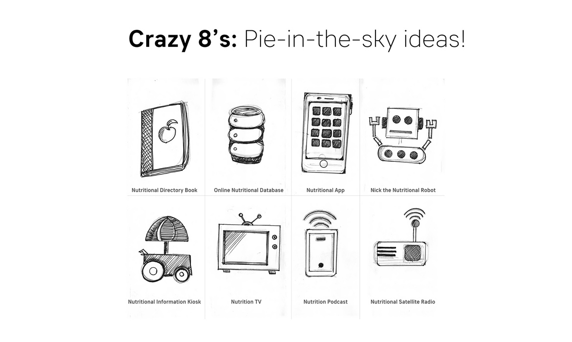
The first step in building out nūtrious was discovering ideas that would help shape what I was going to design. Also, I needed to work out preliminary problems that could arise in the future, as well as business, budget and technology requirements, such as: What were the market opportunities? What would work best to solve users' needs in getting their nutritional information? I started by giving myself 8 minutes to generate 8 sketches. The purpose of this sprint is to propose, "how might we" instead of "how are we?". In the case of nūtrious, an app was the best choice moving forward. Below are my sketches.

Step 2: Research + Personas
Having the documentation that supports and justifies "why" I'm designing and making design decisions revolve around nūtrious' target audiences and are anchored in user stories. I defined targeted users, conducted qualitative interviews and created personas that will be used for centralized focus for this app.
Audiences included: Healthy Eaters, Vitamin Takers, Athletes, Supplement Managers / B2C, Alternative Health Practitioners, People who are healthy and People who want to get healthy.
Some Interview Questions: 1) How are you involved in nutrition? 2) What are your nutritional needs & goals? 3) How might you go about gathering / learning about nutrition? 4) What’s that journey like for you? Can you tell me more about that? 5) What would you want most out of a nutritional app? Why? 6) How might a nutritional app benefit you? Make your life better, etc.? 7) What are some issues you encounter when gathering information about nutrition? 8) What sites or apps do you visit or use for getting your nutritional needs met?
Pattern: Commonalities: One centralized repository to find nutritional information
Research Findings: 1) Receiving advice on a specific condition, getting results and locating products 2) Reading an easy-to-use glossary / reference guide that is clear and concise 3) Tracking deficiencies / nutrient absorption (vitamin intake)
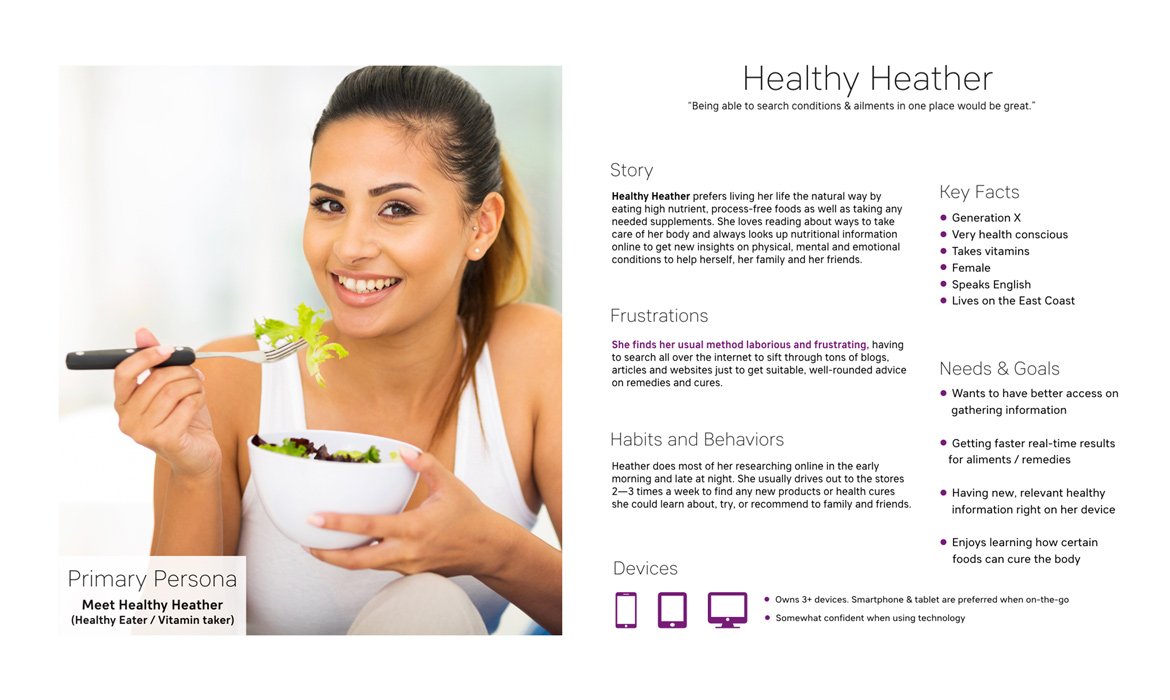
Problem Statement: ‘Healthy Heather’ prefers to get advice the natural way, and often needs to look up nutritional information to get new insights on physical, mental and emotional conditions that she is experiencing. She finds this task laborious and frustrating, having to search all over the internet to sift through tons of blogs, articles and websites just to get suitable, well-rounded results. Her second goal is to locate the products or services she is researching, which is usually done on-the-go.
Hypothesis: From a UX standpoint, I believe in having a mobile app with clear simple health goals / onboarding, with capabilities of inputting / searching for advice on a health condition that caters to Healthy Heather’s needs. This solution could streamline her research gathering process while freeing up time and resources (which was her pain point), so she can get results and locate products and services more efficiently.
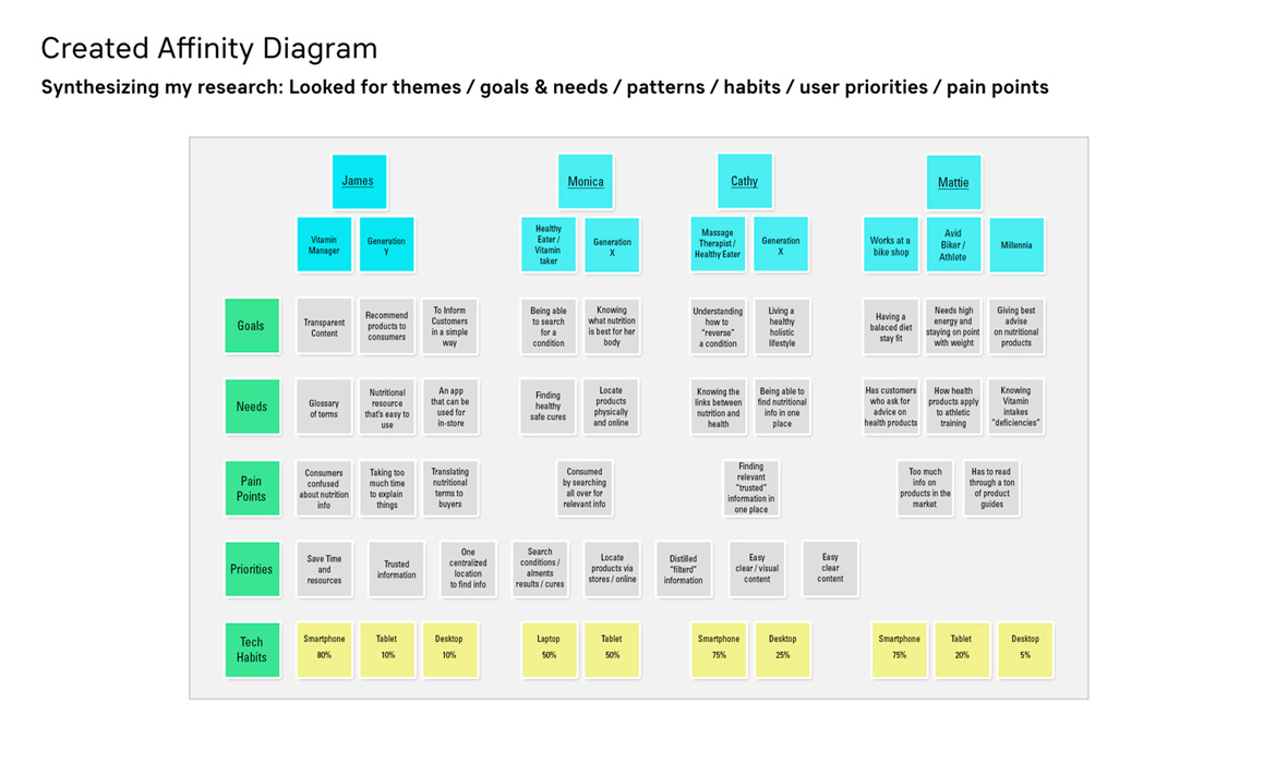
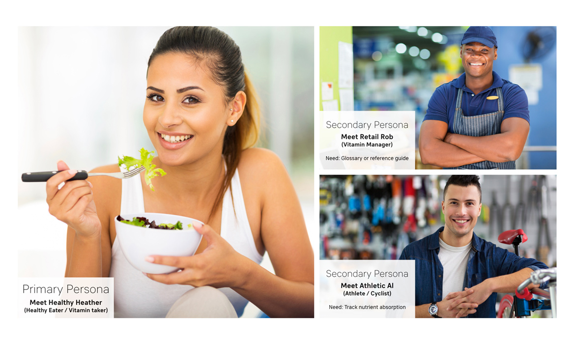
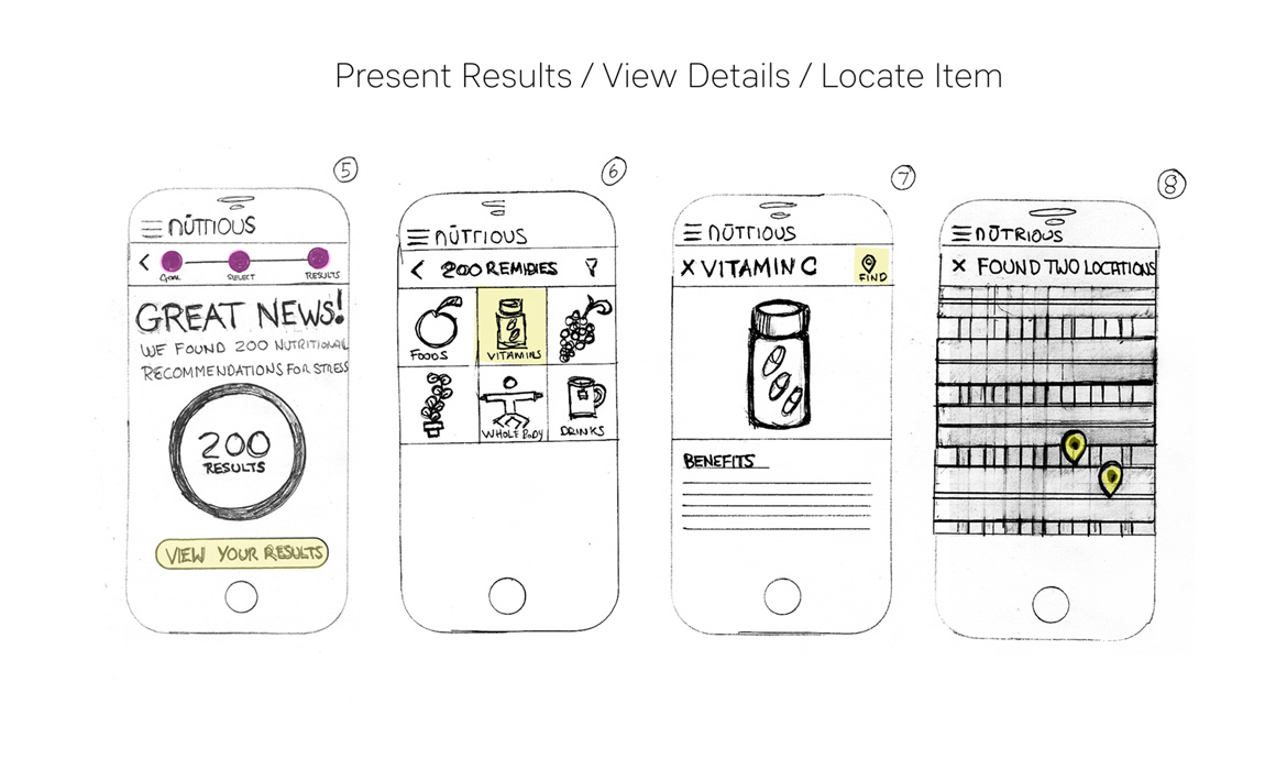
Product Focus: For phase one, I chose to focus on Healthy Heather's core need and goal for: Receiving advice on a specific condition, getting results and locating products. Below are slides showing affinity research diagram and primary and secondary personas.
Step 3: Sketches, Features & Flow
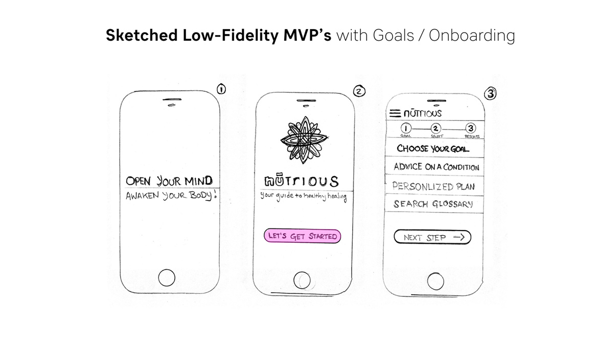
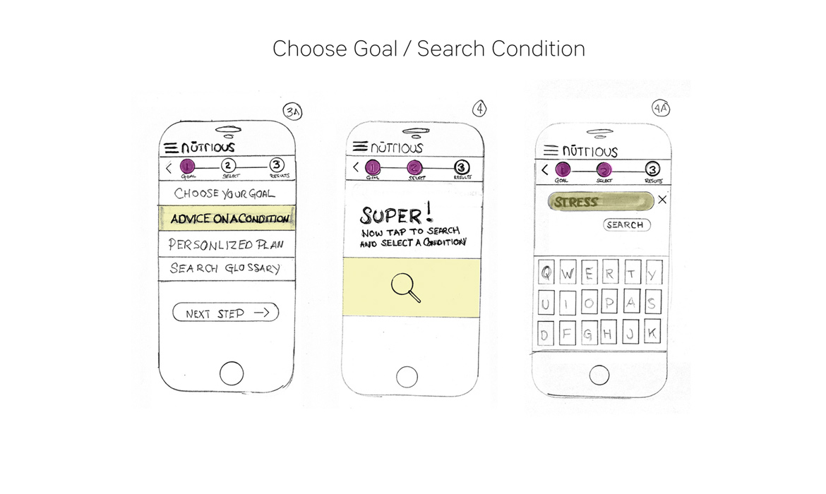
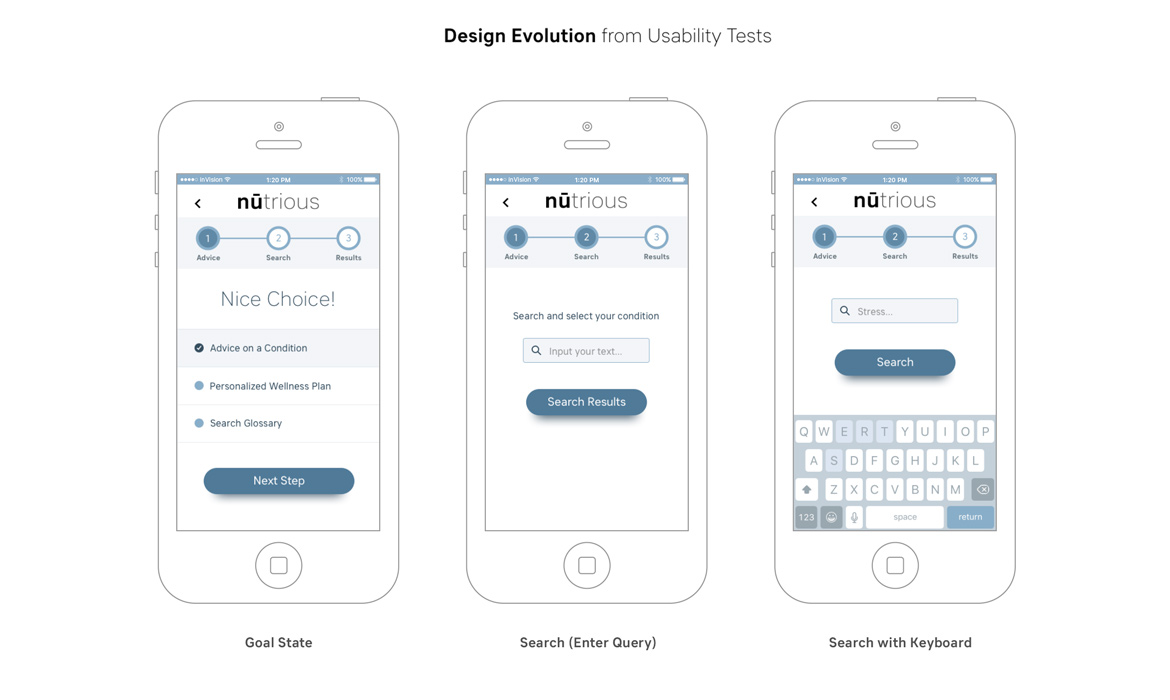
Turning research into visuals indicated with my low-fidelity MVP sketches below. I implemented an agile approach of building out and solving a singular high-level goal. I decided on including an onboarding process, which is “doing-focused” for the user as shown in my drawings below (which walks a user through the first steps or most common actions), and facilitates first-time app users with a clear, numerically-marked three-step UI process (1) advice, 2) search and 3) results). There were two rounds of lean iterative testing done on my MVPs to flesh out a clear flow before I started on wireframing and UI.
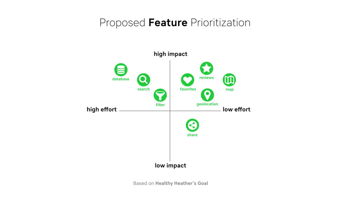
Feature Prioritization: Based on Healthy Heather's goal, I created an infographic with proposed core key features for development / product managers to be collaborating with me on. The document is helpful in also seeing what is of high importance for the user to complete the task, as well as what's feasible within the timeframe of the project. View on slide 4 below.
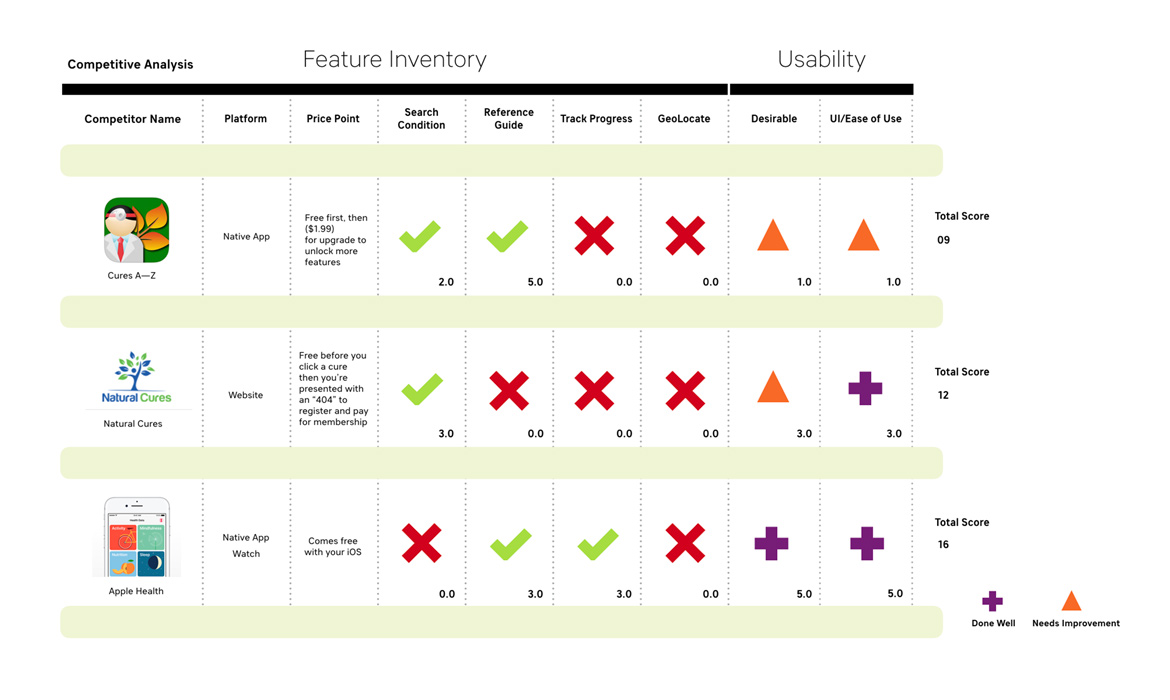
Feature Inventory: I wanted to looking deeper into the market and what companies / products were offering features that were at the core of the nūtrious app (Search Condition, etc.). My approach for this was to research and construct a competitive table chart and layout critical criteria using pluses (+) and deltas (∆) and rate them accordingly based on aligned features, usability, price point and platform. This rating system helped me to focus on how well these other products were designed and what threats they pose. Again, it's all about knowing the value prop and quality of your competition, so you're not "flying blind" on assumptions. See slide 5.
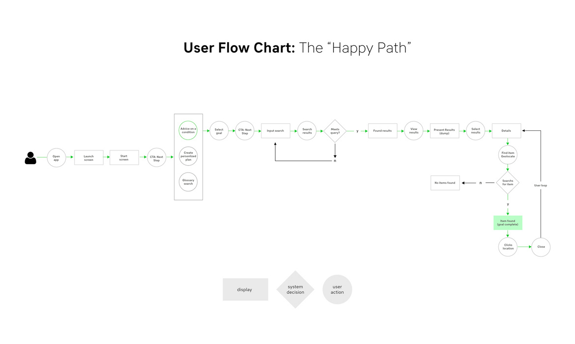
User Flow Chart: My last step in the phase was showing and defining the logical steps or "happy path" along the users’ journey to reach their end task. The flow shows display pages, system decisions and user actions. This is also where I can start to think about the Graphical User Interface / UI as well as CTA. Seen on slide 6.
Animated User Flow: I defined the User Flow further by creating an animation that marks the key steps in a color-coded process. It was useful for team members who find it hard to dissect the flow chart.
View MVP Prototype
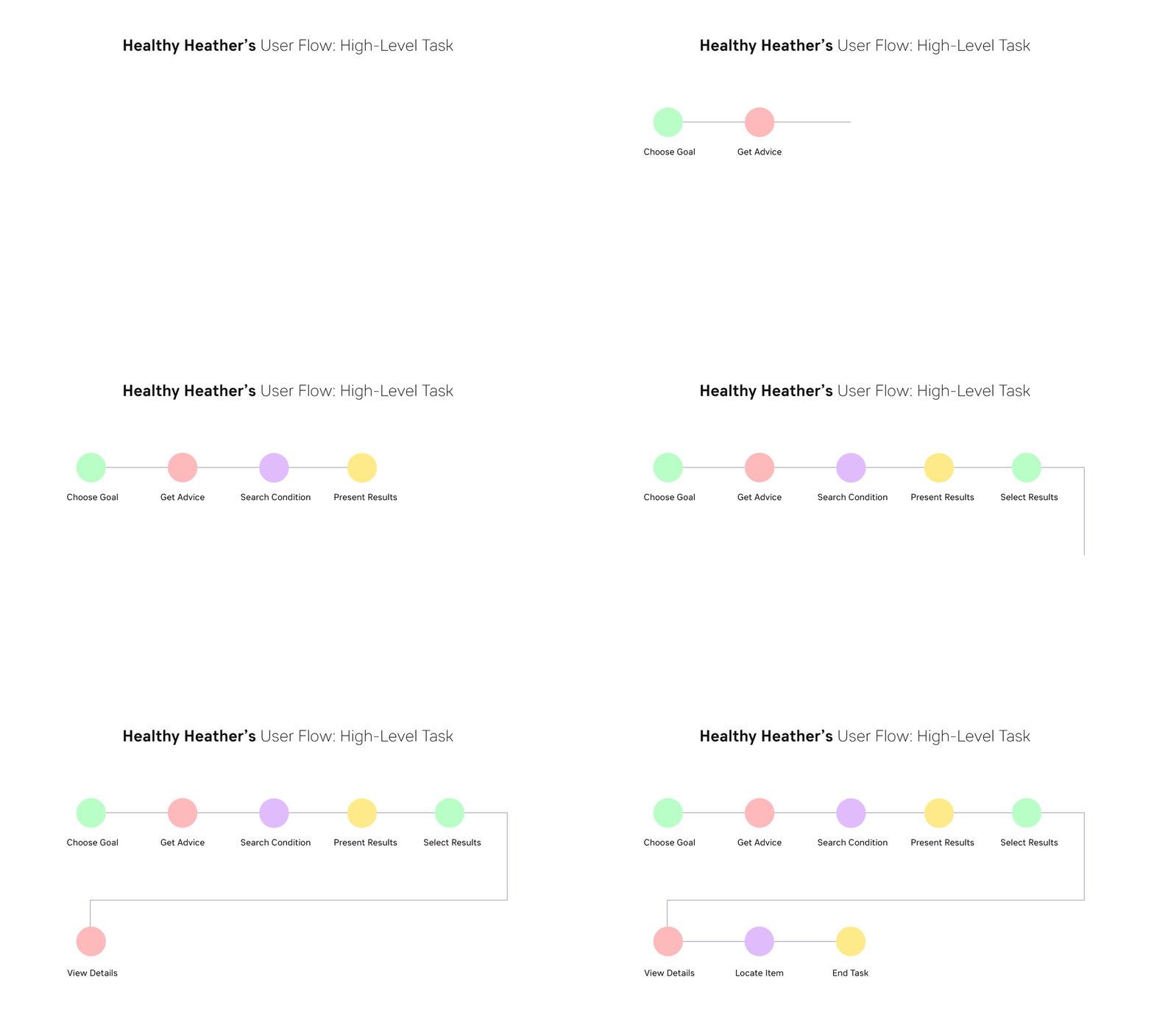

Step 4: Interactive Wireframes & Sitemap
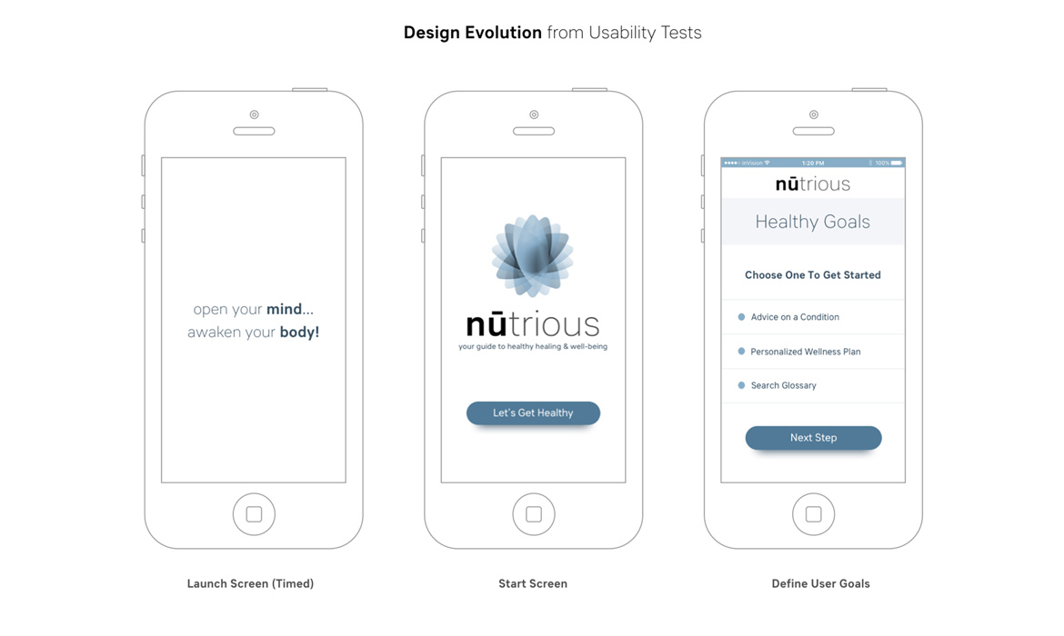
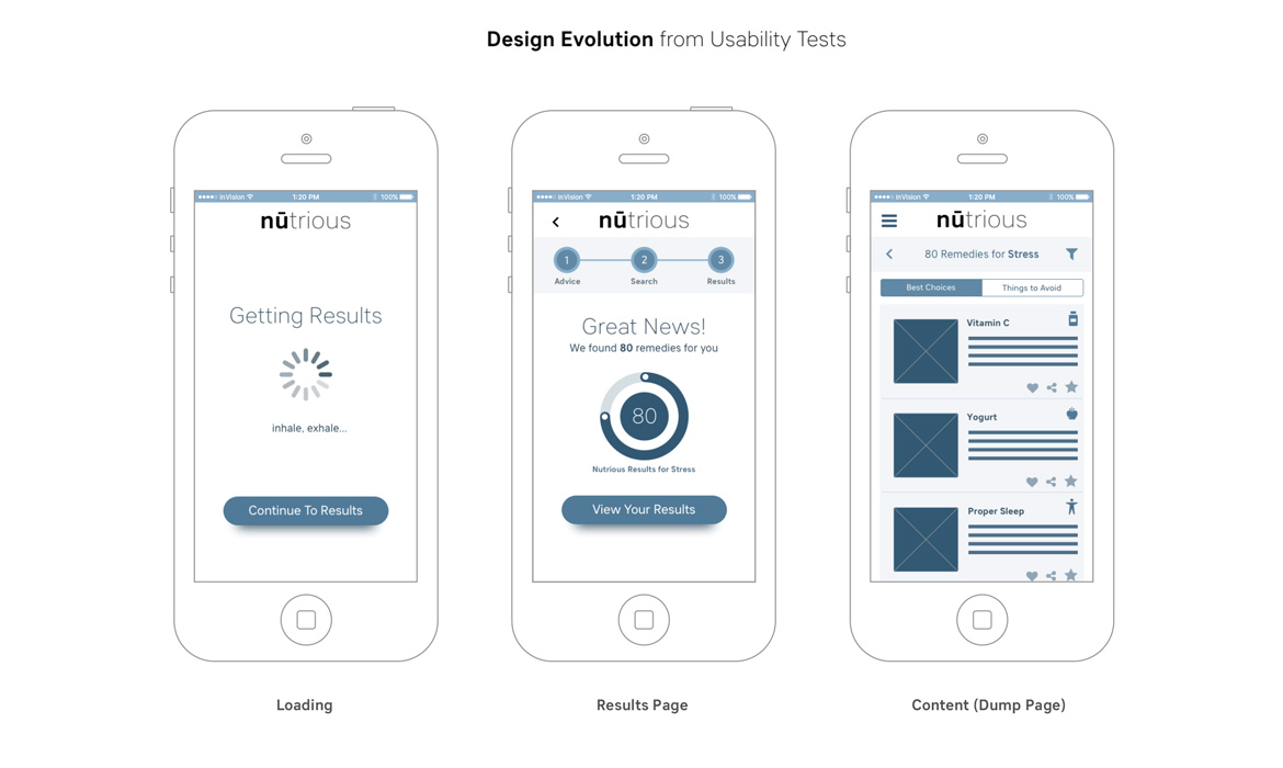
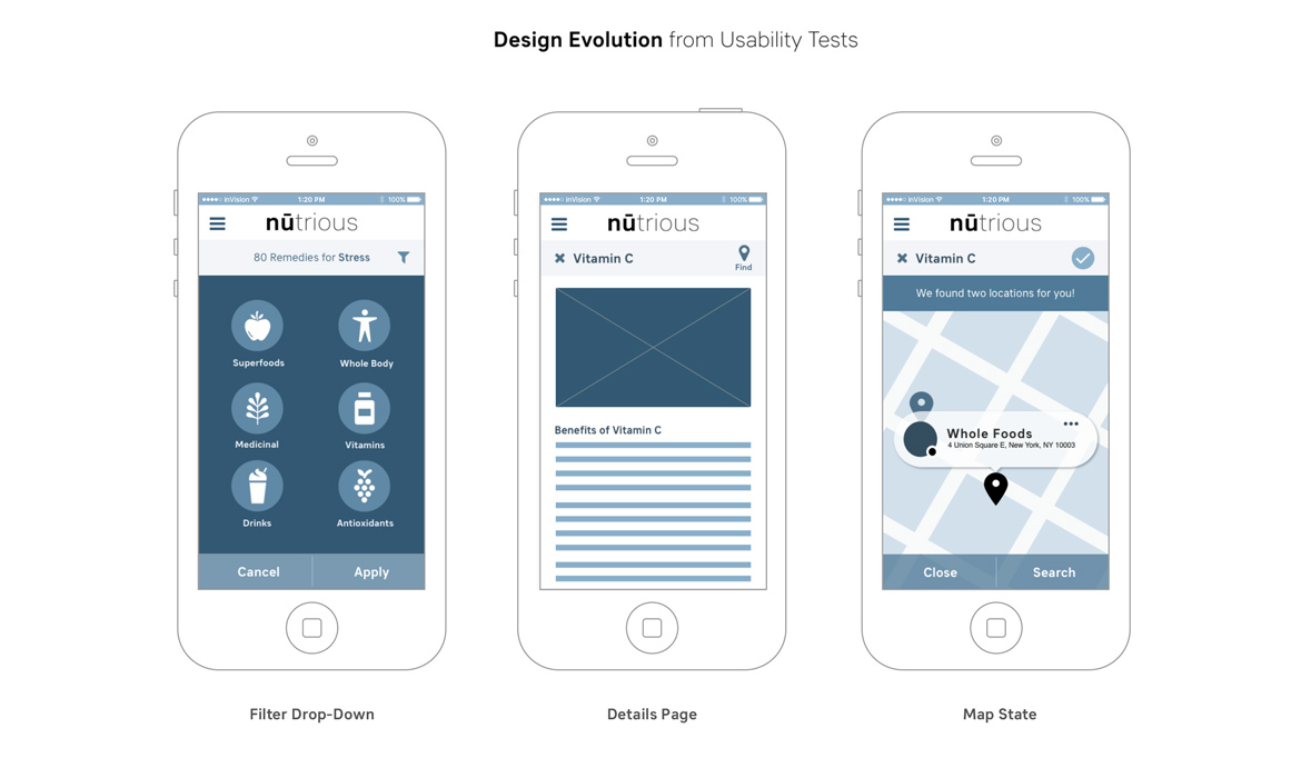
The slides below show the evolution of design transformed from low-fidelity and feedback I received from users. These are what I consider to be medium-level prototypes that are interactive "clickable" with core user features that need to be communicated. They have a more defined, lucid hierarchy of UI, white space, layout / grid, content strategy and the typeface Sebino, (which aligned to the brand guidelines but also was chosen for characteristics of being highly legible on smaller mobile screens). They also convey simple CTA buttons to guide users on next steps, etc. I love designing the screens much like architectural plans, implemented with a bluish hue to indicate that they're in the mid-level phase of development and further usability testing would be needed before high-fidelity. I invite you to "click through" and get a feel of this experience in the link below.
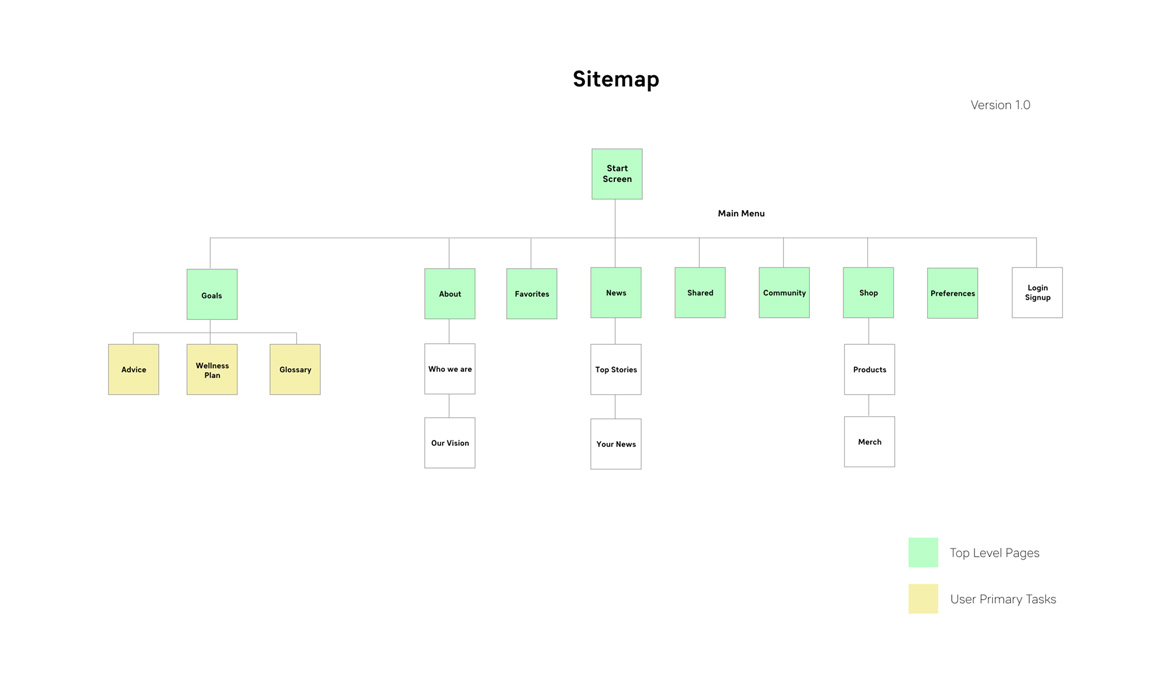
Sitemap: At this point, I started to organize, structure and label content accordingly with (IA) information architecture and creating a Version 1.0 sitemap. This is a moving document that will develop further out over time. Displayed on side 5.
View InVision Prototype
View UI / Visual Design
Step 5: Results + Further Development
The intermediate conclusion of nūtrious feedback is that users are enjoying the product and find the features usable, enjoyable and the design delightful. Solving the UX first enabled me to solve key core needs of users that will need further iterations. The next steps are mission-critical for the evolution and growth.
Next Steps:
a) Further development of nūtrious business model
b) Define brand personality / character attributes
c) Content strategy: Voice / tone / page purpose
d) Card sorting for information architecture
e) Design: Personalized Wellness Program / Sketches, Features & Flows
f) Design: Glossary / reference guide / Sketches, Features & Flows
g) Wireframes and interaction
h) Ongoing research / usability testing / design iterations
i) High-fidelity prototype incorporating visual design standard
j) Visuals: Brand guidelines, style guides, typography, color and imagery
k) App development and programming
l) Deployment.
