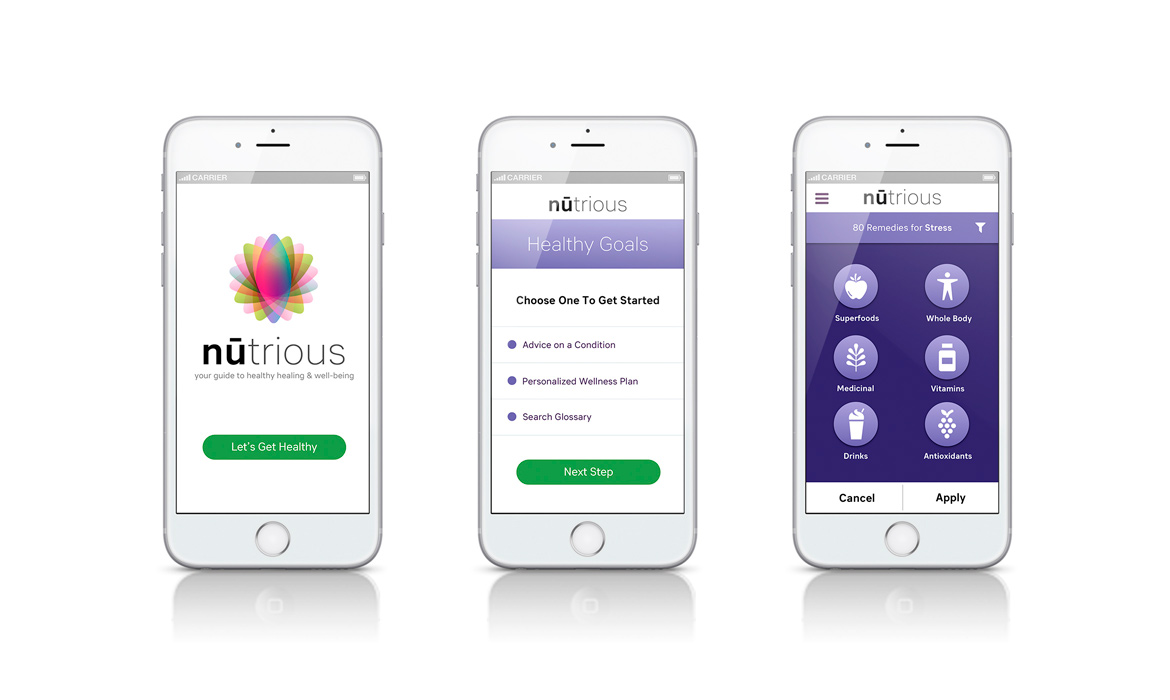
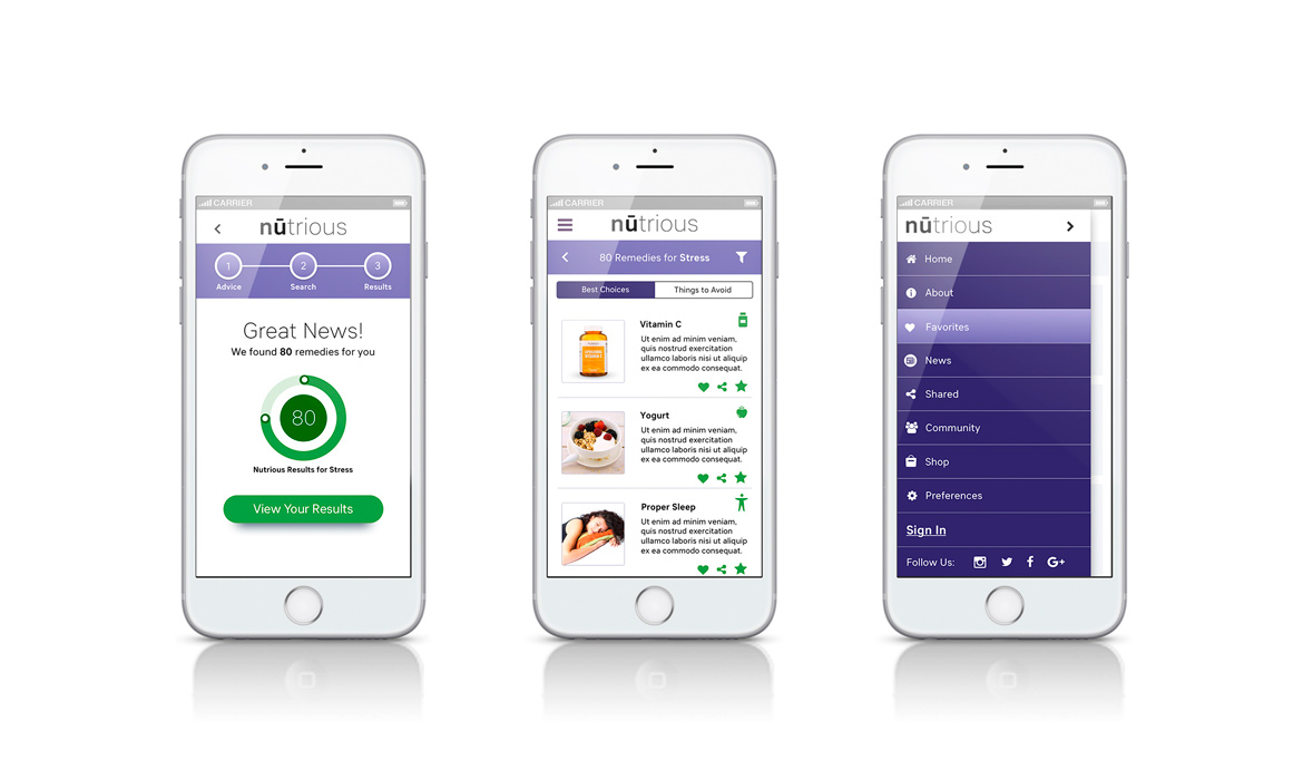
nūtrious Visuals
Overview
Nūtrious is a Health & Wellness startup that focuses on empowering people to live a healthier quality of life through our personalized, managed products and services. We create what’s good for you — naturally!
The Objective
• The Purpose: To create a design language that elevates, communicates and stimulates users pertaining to the nūtrious app
• Design problems being solved: Established a visual guideline of elements that expressed the brand personality, tone and messaging
• Process: Visual Research & Ideation, Mood Board, Logo Design, Typography, Color, Photography, Iconography, UI, Layout and Grid
• Tools Used: Adobe illustrator, Photoshop, Adobe Kuler, Color Oracle, Custom Grid System and My Fonts.com
The Audience
• Client: Nūtrious / Startup
• Target audience: Healthy Eaters, Vitamin Takers, Athletes, Health Practitioners, People who are healthy and People who want to get healthy
• Industry: Health & Wellness
Visual Analysis
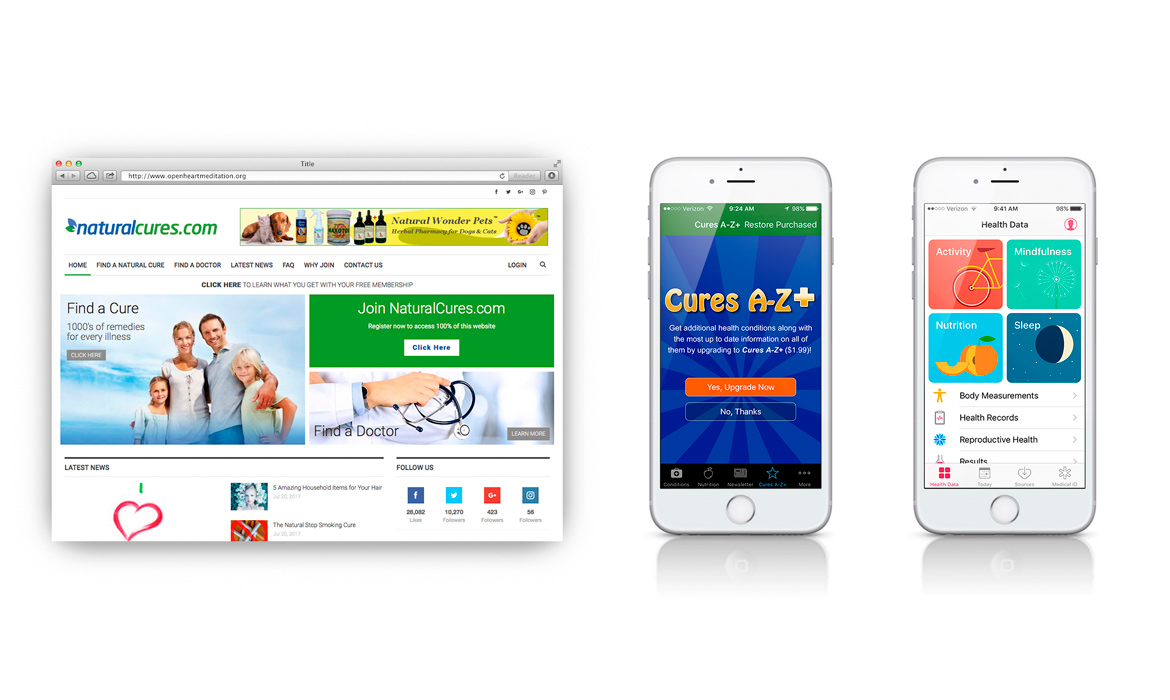
Step One — Research: As an extension to my UX process of conducting a competitive analysis for nūtrious, I also like to look at the competitors’ products in terms of desirability, usability and visual evaluation, which I rate on a scale from 0.0 — 5.0 using pluses (+) and deltas (∆), to indicate what’s been done well and what needs improvement. I observed, how do people perceive their brand in five seconds? Especially in a vulnerable startup landscape, this is essential. How would the right visuals support a clear personality, tone and message to users? This was a concern in a world of online brand choice. I wanted to make sure the visuals differentiated and up-leveled their product over other competitors in the market. Looking at both website and apps in the Health & Wellness space, this first step of assessment was mission critical in deciding what direction to position the app. Bringing the client in early for collaboration also helped set a clear charter moving forward. Target audience, vector iconography, imagery, color and typography all played a role in this decision-making process and making nūtrious a special delight to engage with.

Mood Board
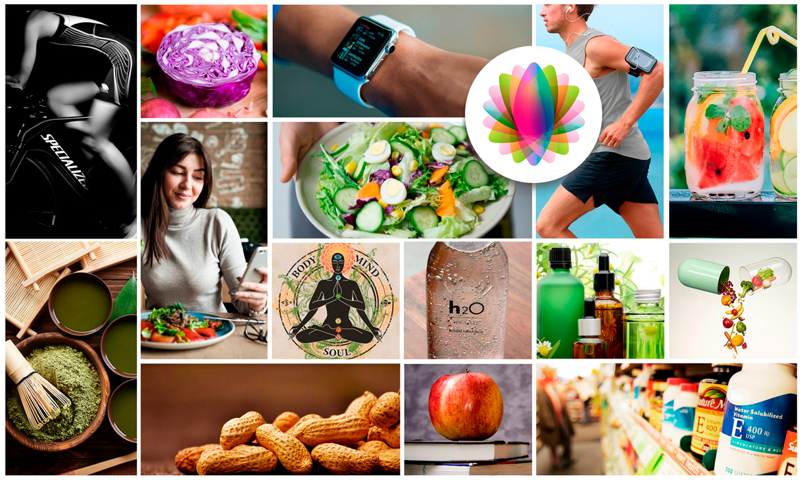
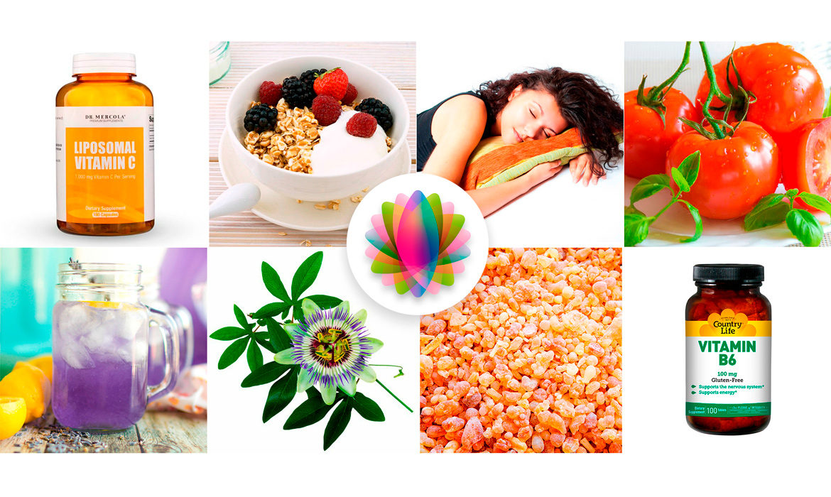
Step Two — Inspiration: Below is the mood board which I created for nūtrious to gather a greater sense of visual direction and explore the ethos of the product. These images reflect color, emotion and mood to help create an overall vision for everyone involved in the project — before we might end up moving in the wrong direction. Here are some adjectives and nouns that best described their company's personality / character. These words helped me craft a system of clarity while having fun in the process.
Descriptors: Healthy, Awareness, Informational, Holistic, Transformational, Universal, Lifestyle, Technical, Harmonious, Nutritional, Oneness

Logo Design
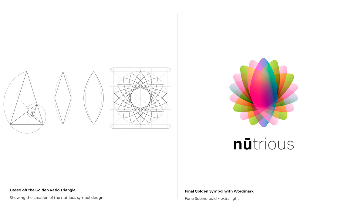
Step Three — Identity: The motion symbol was derived from the golden triangle (as seen in the sketches below), I often like to interject the golden proportion into my designs to bring that something special and harmonious feel to product ideation. This was the case with the nūtrious symbol. I wanted to add an organic aesthetic / conceptual appeal directly to the company’s branding with the triangle that represents these three sides: 1. body, 2. mind and 3. soul. The wordmark was designed and created using a word play technique called "Portmanteau," which combines two words together to create a new word — which in this case is: "nūtrious." With word 1. nutrient: — showing the fusion and omni-growth of materials and word 2. nutritious -- indicating sustainability in a floral, "healthy," elevated kind of way. Next came differentiating the lettering with a CamelCase style with both bold / extra light fonts to help consumers say the name correctly, and then, adding that unique, elevated touch to the, "nu" -- with the bar over the "u" which is pronounced, "new" — hence, a new you! The symbol was orginally designed in black & white, then modified with specific color gradients. As the final touch, I used Adobe illustrators blend modes to create the final version shown below.

Typography
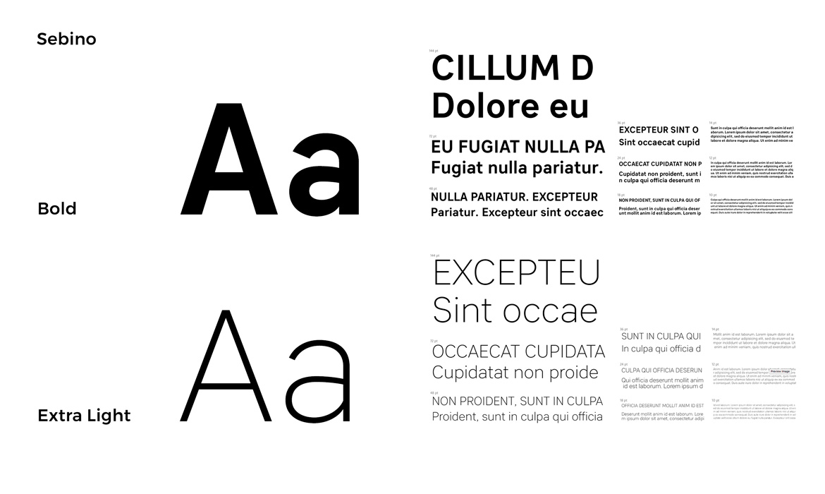
Step Four — Selecting Fonts: Keeping in line with best practices for app-based designs and readability were of high priority. I used myfonts.com to research new modern typeface families I've never used before, and that would be distinctive to this product. The Sebino font family had nine useful weights, a large x-height with open apertures that gave the app "desirability" when scanning content on small devices. I found this font highly legible when testing it on my wireframes with Sketch Mirror. It spoke "freshness" in a sea of overused, dense, cloud-based type choices, and the fact that it was also used in the wordmark design made it cohesive within the nūtrious ecosystem. The final outcome was that this modern, sans-serif font played a critical role in the visual foundation of content creation with clear "call to actions" and interface design.
App type: Sebino

Color Palette
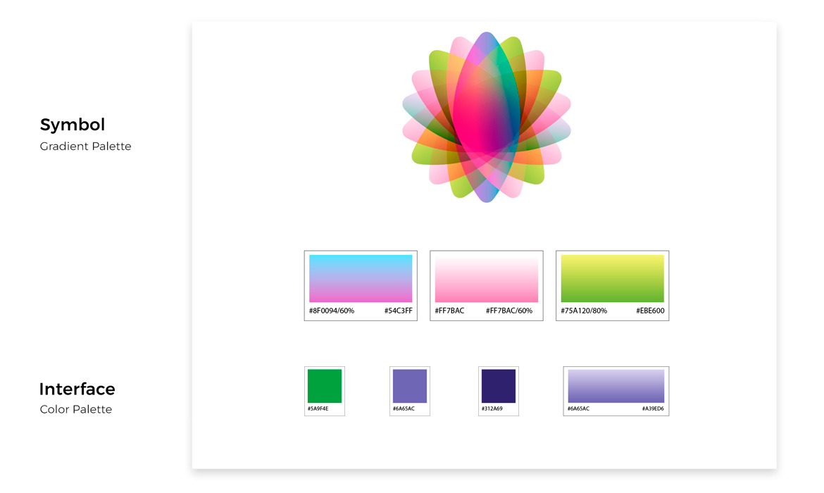
Step Five — Color Theory: Keeping it simple, clear and high contrast for the end user was the intention without causing "visual overload," and due to the fact that my personas were always on-the-go with small screens — they just need to get their tasks done! As a result, my rationale was that I decided that the users (search results) of listed cures be more color showcased and be less about propagating the app full of graphical elements. The solution, was an "easy-as-pie," two-color clickable, interface palette with additional purple hues to offset that on occasions like the navigation or background screens to push CTA buttons forward (see bottom of page for UI examples). I worked with Adobe's color tool, Kuler. I was able to upload an image of the symbol to extract a simple triad of colors based off inner gradients. As for the motion symbol, I kept an eye on UI design trends with gradients being used as big and bold, with plenty of color to grab attention and generate more positive emotions without overdoing it. My color logic is listed below.
Symbol Gradients: Transparency, evolution, clarity, lucidity
Light Pink: Positive, youthful
Purple: Visionary, expressive
Green: Lively, renewal, balance

Photography
Step Six — Image Recommendations: Staying aligned with the purpose of the app and improving upon the experience by choosing a repository of six relevant, Health & Wellness product categories that the user needs to visualize at a quick glance. These images are a result of recommendations on the app's remedies page and need to display a quick comprehension and immediate reliability of color / optimized consistency. Pulling from inspirational images in the mood board, I wanted to set a standard for what types of shots would be showcased here and how they are cropped into the square format. See bottom of page for UI / Image examples.

Style Guide | UI Kit
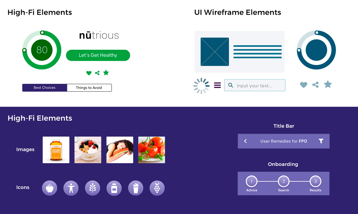
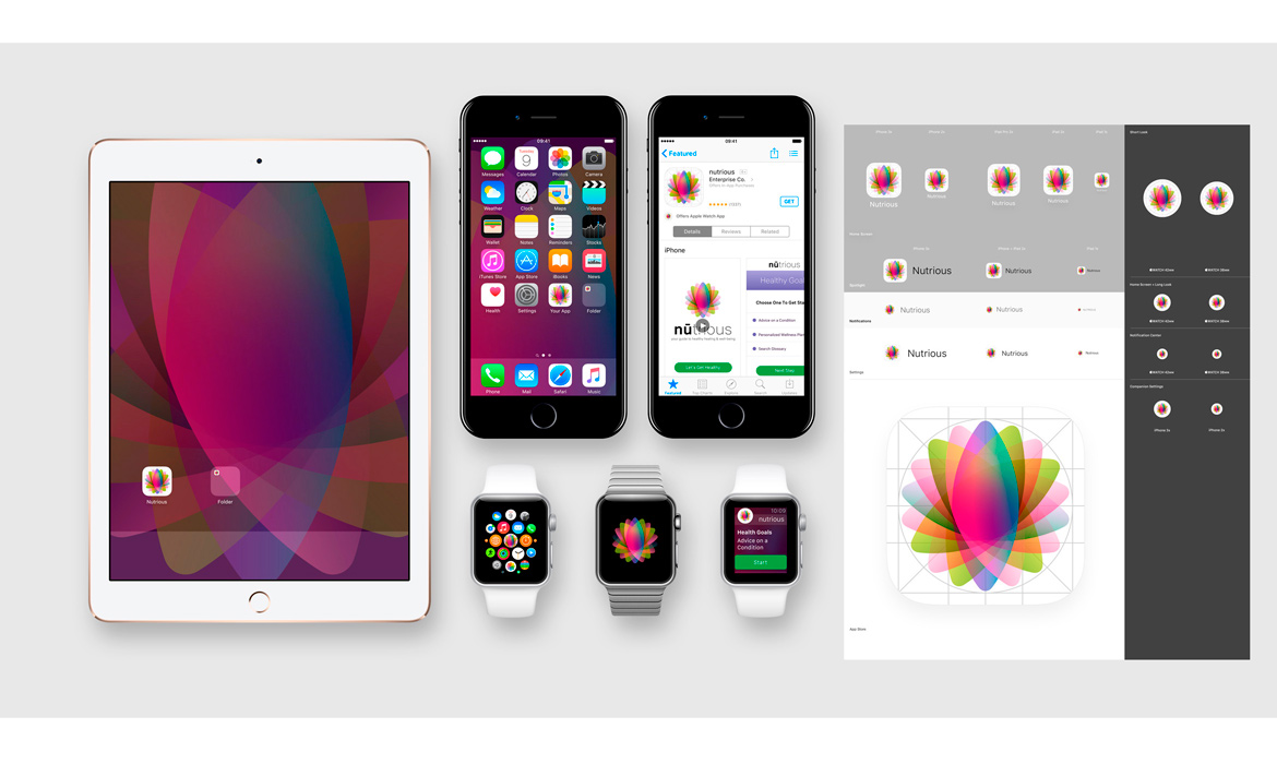
Step Seven — Reusable Elements: Used for the UI interface pattern library for both wireframing and HIgh-Fi prototyping build phases. This assets style guide consisted of clickable buttons, cards, input fields, icons, loading, title bar, features, onboarding and hamburger menu. I felt these graphic components needed to work as a collective system and not just a random set of icons, but as part of the bigger app personality. Used for a quick access, this repository UI kit could be repurposed and built upon as the product grew in scale. Below that shows an example of how the nūtrious motion symbol icon looks on certain iOS devices as well as a super graphic wallpaper.


Grids: iOS App
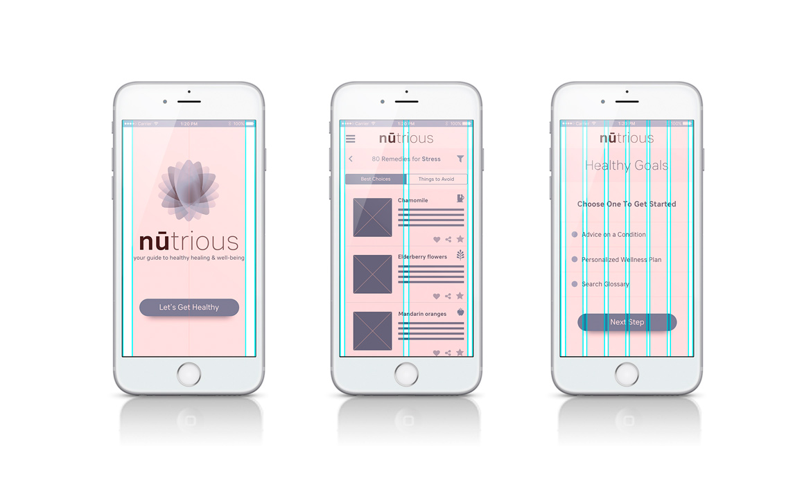
Step Eight — Structuring Layouts: My Sketch artboard template was created for an iPhone 7 at, w: 375px x h: 667px. I designed an optimal grid system that worked for iOS and it was a bit different from that of other responsive bootstrap grid system. Working from that, I set my custom grid to a baseline of 8pt instead of 5px for vertical element alignments. 8pt being the core increment from which the Apple HIG Guidelines are based on, and I added either a 24pt / 16pt to the left and right margins rules for spacing depending on the content. I opted for a gutter width 9px and 12 columns rules of: 1 col, 2 col, and 6 col for horizontal content structure. Below are some examples of working with the iOS grid.

Final UI / Visual Solution
Step Nine — Bringing it all Together: Below shows examples of how the app's UI / Visual design is evolving with implementing the final level of design into high-fi handoffs to development. Staying true to a clean, simple interface that lets the user complete his or her tasks without a lot of experimental, obstruction-al hurdles make for a nice user experience. Making this a most delightful, successful product with further screen prototyping, the user flows, interaction / animations are ongoing and ready soon for a 1.0 "send into orbit" beta launch!
